 This is my submission for PhotoFortnight's current theme ('symmetry'). These broke-open cattail pods were snapped from the boardwalk a few minutes' walk from the building where I work. There's not a whole lot of beauty there in the dead of winter, but once in a while it does show up.I don't use the blog to discuss movies anymore, unless something astounding comes along – but over the past few weeks we've been having incredible luck with our choices, checking such fare as Capote, The Squid And The Whale and Brokeback Mountain in the theatres and solid rentals like The Sea Inside, Grizzly Man and Crash. The Squid And The Whale probably ranks as my favourite movie from 2005 – director Noah Baumbach is good buddies with Wes Anderson, and this flick shares some eerie structural and dialogue parallels with Anderson's movies (most notably The Royal Tenenbaums). I'll be the first to admit that last year saw a lot of crap being released, but 2005 came to a strong close with some of the aforementioned movies. After Squid, the films I enjoyed most last year were a diverse pack – including Kung Fu Hustle, Wallace & Gromit: The Curse Of The Were-Rabbit, A History Of Violence, Capote, March Of The Penguins (natch!) and Good Night, And Good Luck.

The day after New Year's Kerry and I experienced our first homeowner nightmare – a leaking pipe. Only this pipe sprayed hot water for half an hour between the bathroom floor and the main-floor kitchen ceiling before we learned just what to do in such an occasion (turn the water off, yes, but also the hot water – d'oh!). Regardless, the leak eventually cracked open the ceiling (above left) and showered the kitchen with an iron-red wet funk and sent me spilling down the basement steps in a race for the mop. Fixed since – the pipe and my bruises, not the ceiling gash (above right) – and lesson learned: if one hears a noise like running water underneath the floor, chances are it is running water. We're lucky we were home though; had it happened the next day it would have poured its sweet heart out for six hours before anyone would have noticed.
I'd also like to say hullo to Kerry's sister Kath, who just moved to Toronto to study at the U of T, and now lives a block from the actual Degrassi Street (how cool is that?). Advice: watch out for that Joey Jeremiah ... he's a total shyster.

I was half-hoping that the most recent Illustration Friday theme would correlate with at least one of the illustrations from my niece's Christmas book I posted last week – that way I could present it as my submission while I got to work developing my ideas for the next HOWieZine (due at the end of January). And if the theme wasn't relevant, I was going to take an I-F sabbatical to toil on the zine. In the end, neither situation unfolded. The theme-o-the-week – sea – couldn’t have been more uncooperative. But the concept of 'sea' was also too inspirational to avoid. I’m a big fan of the sea, even though I'm 2,000 kilometers from the nearest saltwater. I didn't see the ocean until I was 14, on vacation in Costa Rica. And I didn't see the ocean in my own country until 1999, to visit my mom and sister who had both moved to Nova Scotia. Many of my favourite places I've been to in the world involve the ocean – Cape Breton Island in Nova Scotia and Gros Morne National Park in Newfoundland come readily to mind. Excursions to Dingle, the Aran Islands and the Cliffs of Moher still recall amazing memories when Kerry and I traveled to Ireland in 2003. But my fondest memory of "the sea" is a day trip from my mom's place to Kejimkujik National Park in 2000. Unfortunately, almost the entire coastline of Nova Scotia has been developed in some capacity – and this pristine, tucked-away corner is an obvious exception. Here we walked along an unspoiled beach on a warm September day, the only people for miles. The beach was crowded though, with hundreds of foraging sandpipers on their fall migration – and this image has stuck with me ever since. Side note: I had initially started an illustration this weekend with watercolour and ink, but on Saturday night I cut my hand on a busted wine glass and opted for this more finger-friendly approach, using a combination of Freehand and Photoshop. Above: some of my favourite sea photos (clockwise from top right): Cliffs of Moher, Ireland – Sept. 2003; Kerry at the Doolin ferry terminal, Ireland – Sept. 2003; sandpipers, Kejimkujik National Park – Sept. 2000; cormorant, East River, Nova Scotia – August 1999.
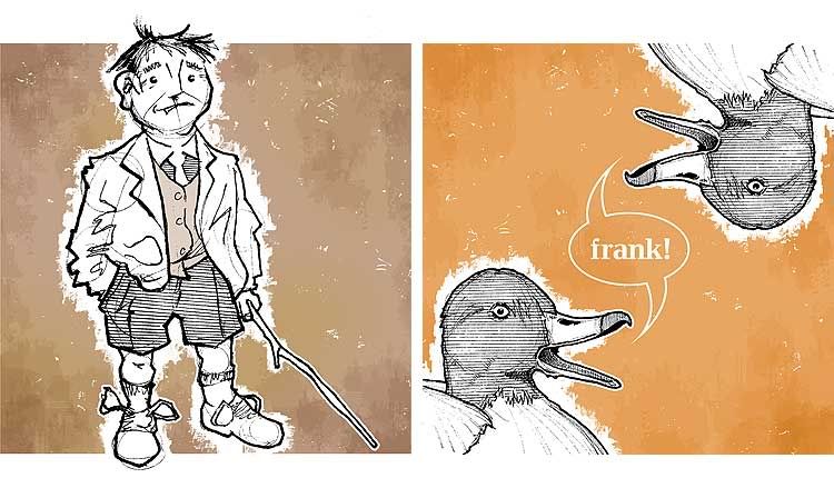
 Here it is. Project X – which I craftily offered a sneak peek of with my Illustration Friday submission for 'blue' (click here to jog memory) – is a book that Kerry and I built as a Christmas present for my niece Cadence. All of 13 months old, Cadence may need a few years under her baby belt until she's ready to appreciate it, but we couldn't wait. An autumn brainchild of Kerry's, Frank Listens To The Ducks is a kid's story based on an anecdote my dad told me when I was little. I won't retell the whole story, but I'll offer up this Coles Notes version: Frank thinks the ducks in a nearby park call his name ("Frank! Frank!"). On one of his many walks, Frank witnesses all manner of weird people in the park doing peculiar things: A man dressed in pink, a woman who calls "You're welcome" to herself, a girl pulling leaves off a tree, a grumbling lady, a jogger that winks non-stop. Frank hears the ducks calling and pays a visit, only to find them crowded around somebody else – a man named Hank, who explains that ducks quack different things to different people: Pink! to the pink man, thanks! to the shouting woman, yank! to the girl, crank! to the grouch, wink! to the jogger. Frank learns that quacking ducks are a shared commodity – but still thinks these people are weirdos. These illustrations are in the sequence in which they appear in the book. All were sketched in late November and early December, following extensive sit-down time with Communication Arts illustration annuals for inspiration (after initial doodles failed badly). Sketches were done in pencil, then inked over with Pigma Microns of varying thicknesses. Because I haven't drawn enough to have a style of my own yet, patches of patterning were added using a ruler to keep a sense of visual continuity throughout. Continuity was also aided by using a common background theme of basic colours, type inserted into each image, and a faux-watercolour texture built in Photoshop. The duckies were referenced from slides at work.
 The first two illustrations (above) are of Frank, and a pair of redhead ducks calling his name. The font used with these duckies is Candida. You can click here to get a better look at this pair.
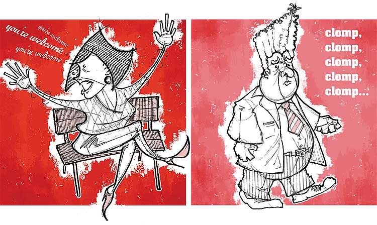
 This pairing (above) features the Pink Man and the shouting woman. Pink Man's font is Aachen; the woman's is Ex Ponto. I like drawing fat men in suits. Click here for a closer look.
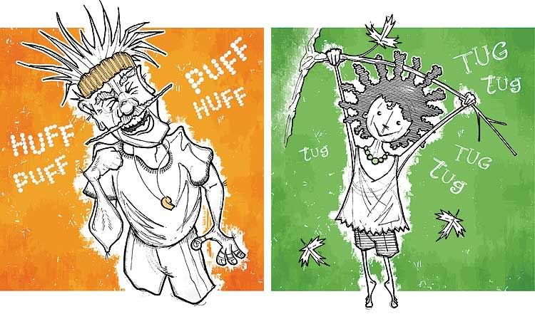
 The girl pulling leaves off a branch and the winking jogger (above) were harder. Children are hard to draw; I've rarely done it. The jogger's face was based from a caricature of Geraldo Rivera. His font is a downloaded freebie called Rocky Mountain Spotted Fever; the girl's typeface is another freebie called Sketchbook. Click here for a closer look.
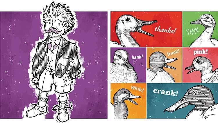
 This final set shows Hank and a collage of ducks (above) voicing different words. Hank is a duplicate of the Frank drawing, only mirrored and moustached (done on purpose, not laziness). Clicky here for a closer look. Factoring in a slow work pace, procrastination, printing, cutting and binding (black plastic coils inserted by local office supply joint), the work lasted about four weeks from the time Kerry gave me the copy to the point where it was ready to mail. Copies were also made for my dad and for Kerry's niece and nephew. I have a PDF of the book in viewer's spreads available for anyone who wants a look. Drop me an email (j_wolfe at ducks dot ca) and I'll happily send one to ya.

A quickie. There was recent talk on the HOW forums that I inhabit, about the word flavour. Fellow forum haunt Von Glitschka was asking people about the foods they abhorred as children for his submission to Illustration Friday – and natch, some of the same words got repeated over and over: Brussels sprouts, liver, mushy peas. Broccoli was mentioned specifically as a terror for kids, but that's a known fact by now. Even the President has been openly vocal about it. The word got me thinking though – about the flavours I hated and liked as a kid. I hated fried onions (still do). I hated the giant two-ton sack of puffed wheat cereal my mom would buy. I hated rice pudding and raisins in baking. When I was very little I hated pizza, and would opt for spaghetti whenever the family went out for pizza. Nobody seemed to mind. But I liked all those despised foods mentioned above: Brussels sprouts, liver (chicken livers, especially), mushy peas, casseroles ... even broccoli. I ate my broccoli so fervently I pretended I was cutting felled trees with a chainsaw. And sometimes I even made the noises for it. Side note: I tried out the Pigma brush pen I bought awhile back for the first time. It was a little clumsy working with it, but the thicks and thins it provides are kind of cool. I might rework the quickie colour-work added to this one; I'm not that tickled about it. I may change it down the line.

I enjoyed keeping this site together over the past year. I've never held myself to a New Year's resolution before – never bothered setting one – and to look back now and see the stuff I've posted gives me a good feeling. Even though the original aim was to create something new each week, I consider the goal reached. I couldn't have factored in things like vacations, a month of moving preparations and spending the last weeks of the year working on Top Secret Project X (which I'll post next week: promise). I posted some reruns, quickies and remakes, but in the end I now have 43 new pieces of work I didn't have at this point a year ago (click here for a better look of the image above). And seeing how during the previous year, I might have come up with less new work than I have fingers on my two hands, I'm a happy camper.Because I set for myself two other related goals (one failed miserably, the other a so-so pass), the results aren't all glowing. But put them all together, and I still graduated. So thbbbbpt – and on to next year.I thought briefly about the status of this site a couple of weeks ago. It held me accountable to my resolution, and now that 2005 is over then mebbe it should be, too. After all, with the amount of time updating and writing all this stuff, technically I could have been putting myself to use in other ways. On the other hand, it kept me off the streets, my brain ticking, and largely away from the television. In the end, I decided to keep Jeopopolis on the air. And for 2006, I will keep trying to come up with a new bit of creativity once a week – and posting it here. Consider it a re-resolution.I'm also gonna go on the record here with a related resolution, to keep up a sketchbook. Though I did all this stuff in the last year, not a great deal of it was with the aid of honest-to-goodness sketching or doodling. It doesn't have to be complex art, just an effort. More pencils. More direct observation. That sorta thing.Thirdly, a totally unrelated third resolution: this year I am going to ride 2,080 kilometres on my bike before next winter. I have an odometer, and as a stats junkie I like to keep track of the distance it rings up (2,080 will bring it to an even 5,000 since I attached it). Last year, almost solely on commutes, I rode 1,100 kilometres. In 2004 – which was extremely crappy in these parts – I rode 1,200 kilometres, largely bolstered by a quickie spring biking vacation in Jasper. So this summer, I want to use my bike more as a means of exercise/stress-relief on top of regular commuting. It can easily be done. I just have to be all Nike about it and do it.I want to thank the people who took time to come and visit this site. I never imagined back in January that it would receive as much attention as it has. So, if and when you read this, consider yourself thanked. The comments and support are greatly appreciated. And if you have a favourite image from all the posts in 2005, drop me a comment or an email (j_wolfe at ducks dot ca) and I'll gladly send you an electronic hi-res copy.All the best in 2006.

This is our first very own Christmas tree. There are many more like it, but this one is ours. And it's not really a spruce, but a balsam fir we picked up at StupidStore (Canuck shop-o-plex SuperStore, for the American reading masses) for twenty bucks last week. It thawed in our basement overnight, and the next day I sawed a slice off the trunk and fit it into our oversized tree stand. We borrowed leftover ornaments from Kerry's parents. We used a string of white lights, some covered with plastic lizards (above right) from an old strand of lights from Kerry's childhood bedroom, and popped a puffin hand puppet on top as our angel. It's adorable, and I'll never forget it. Size-wise, it pales in comparison to the long-needled monster trees my mom got when I was growing up (mebbe I was just smaller?). They were beautiful in their own right, but a sense of dread always came with them because it was my job to pick up the thousands of dropped needles. Mom wouldn't let me use the vacuum. She said the needles would clog the hose. And I defy that logic to this day. The two moments I was most excited about when we bought our house was handing out candy to kids at Halloween and putting up a Christmas tree. I feel this year has been that much sweeter having these two moments now tucked in it. Side note: I'm in the process of making changes to this site (as you can see). I've switched to a new background template to wrap up my first year of blogging, to better enable myself to be able to customize it further in the future. So please bear with me as I feel my way through a dimwitted spell of tinkering with web design (web design lite, really) – and if anything appears funny then by all means let me know, especially those using PCs. I already know it will wreak minor havoc on archived posts, because I've altered the width of the main content column so I can post slightly larger images. But still, lemme know.

Recently, the local chapter of the Society of Graphic Designers of Canada (GDC) held a button swap – where interested members could create a design for a one-inch button. The entries were then gathered, printed, and shipped back with each submitter receiving a copy of each contributor's button – and, as it turned out, a whole whackload of their own (which I gave away at a dizzying pace earlier today). Kind of a neat concept, but the turnout was way less than expected, most likely because of Christmas and being broke and such. Hopefully the GDC does another run later on when people aren't so distracted. My button was probably the quickest to make; I took a photo of Kerry's belly button and basically sent it in as is, with this message (right) that wound up getting clipped. Ah well... having the collection is kind of cool, anyway.

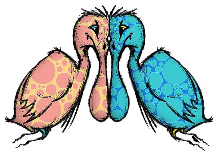
The second-last Illustration Friday theme of the year is appropriately enough, imagine – and as such, nearly every thing imaginable qualifies, like these two chaps imagined from the depths of my brain. They say opposites attract, but more often than not opposites also repel – and these two obviously are not taking the season's good cheer to heart. This was a quick sketch of one bird done in pencil. After scanning, I duplicated the bird, flip-flopped it and then brought the two beak-to-beak. The fill is just some Photoshop goofiness, also inverted for the duplicate bird. Click here for a closer look. Before the year draws to a close and everybody toddles off to their own corner of the world, I'd like to take this opportunity to wish one and all a fabulous, merry, happy Christmas. Enjoy what time you have off, and take the time to chill and appreciate the good things that are happening all around. Personally, my family is scattering itself across the country – across the New World, actually – to gatherings in Newfoundland, Ontario, Saskatchewan and even Nicaragua (my mom, bless her, avoiding all things freezing and exploring Central America until May). Kerry's amazing family unit is taking me under its wings again, keeping things nice and Christmassy – and for that I am extremely grateful. And to the wonderfully supportive online clans of visitors from both Illustration Friday and the Howieverse, have a safe and smooth set of holidays. Wherever you may be, and whoever you're with, enjoy. Bonus: below is a Christmas e-greeting of my company's art department I made for us to send out to all sorts. The top-secret photo shoot was done a couple of weeks ago. That's me in the top right of the group, but all the guys have wigs so don't nobody go thinkin' this is how I present myself every day. Tinting, saturation, type-work (the font is Adobe's Bauhaus) and two out of three moustaches are the result of some added Photoshop magic. Merry Christmas!


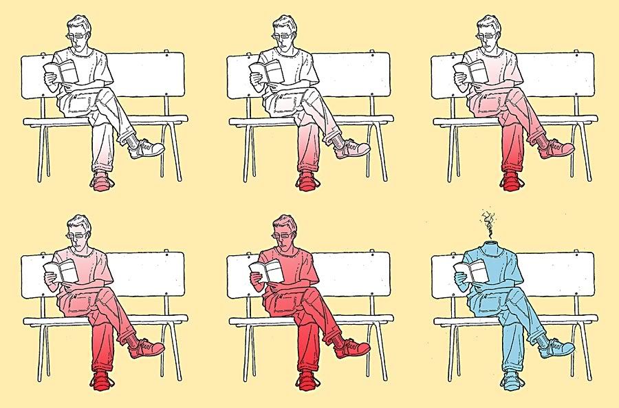
It's Christmas-time, so I hope this little piece of imagery doesn't come off as too macabre. But really, go and peruse the lengthy list of Illustration Friday submissions for the word surprise – then come back here and ask yourself, is there really anything more surprising in life than sitting on a bench, reading a book … and then spontaneously combusting?


Not that this week's Illustration Friday theme (blue) particularly speaks to me, but for some odd reason I find angry people a heckuvalot easier drawing subject than happy people – probably because it's just that much more conducive to line-work. So, the word 'blue' gave me the chance to show off this cranky woman I just finished today. The inspiration came mostly straight outta my head, with a few exceptions; the idea of giving her fat, inflated fists came from a fridge-magnet illustration I made a few years ago – and the white fringe around her figure is created from Photoshop brushes once again complements of Philadelphia designer Keith Bowman (these brushes were also deployed for my Illustration Friday envy submission in the summer).The initial illustration handiwork was done in pencil and a few different pens (line-work through her hair, collar and pants was helped out with a ruler, too). It was then over to Photoshop to insert the background and fist fills, as well as the bits of text. Clicky here for a closer look, but watch out for them fists.


