 I will be the first to admit, I don't dabble in the procuring of typefaces perhaps nearly as much as I should. But when I heard about the promotions surrounding the offering of Gibson, a swish sans-serif set, for dirt-stinking-cheap – and moreso, the reason why – I plonked down for this great cause. And I encourage you to do so as well.More, on Gibson:The Gibson font family is a humanist sans serif typeface designed by eminent Canadian type designer Rod McDonald, and produced by Patrick Griffin and Kevin King of Canada Type, to honour John Gibson, one of the original founders of the Society of Graphic Designers of Canada (GDC).As well as paying tribute to Mr. Gibson’s productive life and love of the typographic arts, the Gibson family is intended to be a mainstay of the future of Canadian design education. Many Canadian design schools and institutions will be making it part of their larger type piracy education programs. The eight-font family is available at token pricing to make it especially affordable for design students. For less than the price of a design textbook, a student can now have a sturdy and contemporary humanist sans serif family that fits pretty much any design application, and will remain useful long after academic studies and well into a professional career in design.All revenues from its sale will be donated by Canada Type to the GDC, where they will be allocated to a variety of programs aiming to improve the creative arts and elevate design education in Canada. Each of the eight Gibson fonts comes with 370 characters and feature extended Latin-based language support. The Gibson family ships in cross-platform OpenType format.
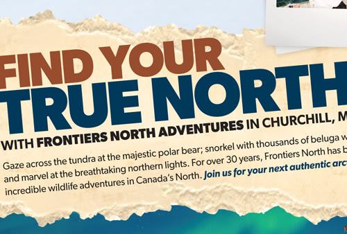
 The face(s) have come in handy for myself with a quickness; I've already used Gibson to craft labels for maple syrup bottles through work, and for a freelance jobbie, an ad for a company organizing high Arctic tours. And cripes I say, what is more Canadian than that? And that? I urge anyone reading this with a designerly bone in their body, to get on that action. It's a great cause and for 48 loonies, a price that can't be beat.
Wrong number messages: my favourite kind of messages.
Turtle and mushroom by Kerry.
"It's good... just gotta take it slower."Famous last words, before proceeding a few more metres in the CR-V and getting stuck. Only nine of the 40-kilometre stretch of foggy logging road had melted to a point of navigability. Cue rigourous rocking/pushing sessions, a couple hundred metres in reverse to the nearest turnaround point, and then high-tailing it back to asphalt. The 2011 nocturnal owl survey was over before it began.
A couple of weekends ago, I opened up my vault of photo-a-day photos to see which ones might best benefit from tinkerings with various black-and-white conversion techniques in Photoshop. During the thick of the project, I had often wished to convert some right then and there, but was adamant in sticking to colour and minimal dickings-around with post-processing. These are my favourite six results from this bout of playtime. You can click on any of the images, to view them larger. Using Photoshop calculations I played God, and turned a red fox white. I was able to separate the subject from the background, a feat I was hard up to perform on this overcast evening with fading light.
 Through greyscale conversion I was able to chase the nasty streetlight hues of this original scene and focus on the sheer dump of snow we received one evening last November. This was before the bleakness of the season really set in, and snow like this was more of an exciting thing.
 I appreciate how a good conversion can bring out otherwise muted textures. All beiges and light beiges, this savannah sparrow during a songbird banding session at work, remained still enough for me to focus him right in the eye.
 Here's me. So emo, during the golden hour and dog days of last summer. I had a lot on my mind and stuff, you know. Just needed a good sit-and-stare, sort some issues out. You know. Stuff.
 Here's another shot of me, by guest photographer Anton Corbijn. Anton and myself had just been dying to do a project together…
 But, enough about me. Here is my favourite converted photo from my shufflings through the 365 stacks – and it's not just because of the subject matter. I enjoy everything about this image: the reflective hair strands, the uniquely-sized pupils, and especially the silhouetted outline of the right side of Kerry's head. I think I'm in love.


