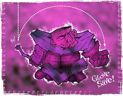
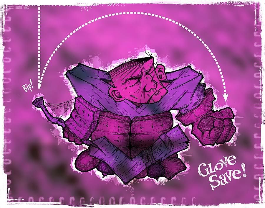
In the olden days, NHL goalies were the players who couldn't skate as well, the ones who were a bit chubby or slow on the uptake. Not so anymore. Goalies are now the ultimate athletes on any team – the most flexible, the most acute and aware. There is sparse glamour in the modern game, but on any given night a goalie can (both literally and figuratively) stand on his head and steal a win. The other day I watched a recap of a 7-1 game, and the standout highlight was a phenomenal diving save – by the losing goalie. For this week's Illustration Friday I've flip-flopped the theme (glamour) and created an entirely unglamorous homage to the helmetless, chain-smoking goalie of old. The initial sketchwork was done on Sunday in pen and pencil. A wash of colour – as well as border textures and some minor surgery (this was not the sketch's original face) – was completed in Photoshop Monday night. Click here for a closer look at the detail. And as always, let me know what you think.
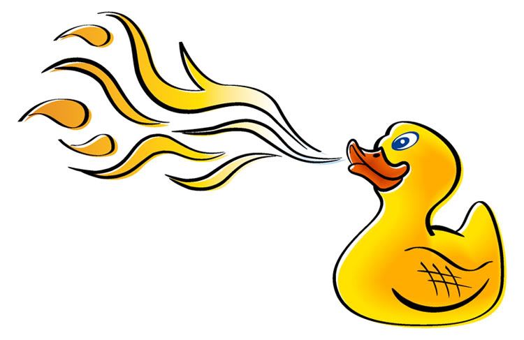
 The HOWieZine pages are cut and ready for shipping – so I used time this weekend to mebbe submit something for Illustration Friday, but drat the luck, their theme of the week is cats. Not that cats aren't fine in their own right, but I have a hunch the I-F listings this week are gonna be chock-full of cute widdle puddy-tats and Garfield knockoffs, and I can't get myself up for that. Nor was my midwinter shell of a brain ready to massage and work the theme to suit my tastes. So instead, I sketched myself the biggest, baddest ... um, rubber duckie. This came from a discussion last week about entering a team from Ducks Unlimited for Winnipeg's annual August dragon-boat races on the Red River. And natch, the first thing that pops into my head is this hombre. I did a loosey-goosey sketch first and worked the final illustration in Freehand (click here for a closer look). Side note: This illo will also be on display over at Sugar Frosted Goodness!, an all-illustration, all-the-time team blog constructed by online compadre and blog-birthing machine Jeff Andrews. Have a moment to spare? Check it out; there's already some excellent work on display.
I don't usually do anecdotes, but I'm toiling away this week on my HOWieZine submission and don't want the place to get too dusty. Plus, this story makes me laugh everytime I remember it now. It happened like it was yesterday – because it did. A coworker and I got on the bus in the morning, about 7:30, to get to our carpool pick-up spot. The bus is moderately full, some available seats but not two beside each other. So we stand in the space near the back door. There's seats in the back, a seemingly innocuous old lady mutters behind where we're standing. But we're waiting it out; it's not a long ride. Then: There's seats in the fudging back. And then, to the equally old woman beside her: Fudging backpacks in my fudging face. And then: Do you see this? Fudge. Fudging backpacks. I fudging hate these fudges who fudging stand right in my face. Two seats then become available, so we head for them. The lady swats at my friend's bag as we vamoose. I lean in. Don't touch her, I say. Fudge you. Fudge you and your fudging backpacks. I'd flip normally, but it's funny. I can't help it. The guttermouth on this otherwise kempt and benign senior citizen. My friend and I sit together for the next five minutes or so, all the while this woman continues her low-key barrage of backpack-related fudge. I'm stupefied. What could possibly make an old lady this cantankerous by 7:30 on a Tuesday morning?
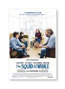
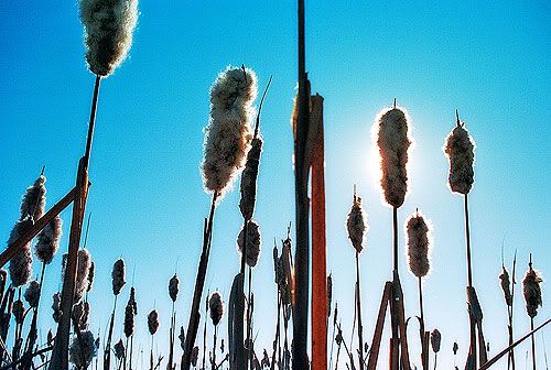 This is my submission for PhotoFortnight's current theme ('symmetry'). These broke-open cattail pods were snapped from the boardwalk a few minutes' walk from the building where I work. There's not a whole lot of beauty there in the dead of winter, but once in a while it does show up.I don't use the blog to discuss movies anymore, unless something astounding comes along – but over the past few weeks we've been having incredible luck with our choices, checking such fare as Capote, The Squid And The Whale and Brokeback Mountain in the theatres and solid rentals like The Sea Inside, Grizzly Man and Crash. The Squid And The Whale probably ranks as my favourite movie from 2005 – director Noah Baumbach is good buddies with Wes Anderson, and this flick shares some eerie structural and dialogue parallels with Anderson's movies (most notably The Royal Tenenbaums). I'll be the first to admit that last year saw a lot of crap being released, but 2005 came to a strong close with some of the aforementioned movies. After Squid, the films I enjoyed most last year were a diverse pack – including Kung Fu Hustle, Wallace & Gromit: The Curse Of The Were-Rabbit, A History Of Violence, Capote, March Of The Penguins (natch!) and Good Night, And Good Luck.
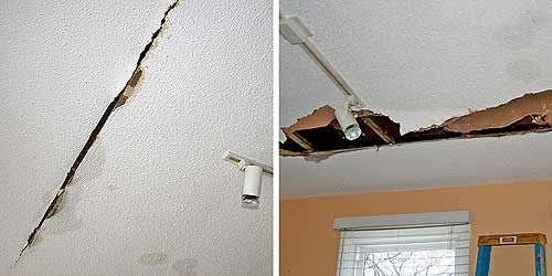
The day after New Year's Kerry and I experienced our first homeowner nightmare – a leaking pipe. Only this pipe sprayed hot water for half an hour between the bathroom floor and the main-floor kitchen ceiling before we learned just what to do in such an occasion (turn the water off, yes, but also the hot water – d'oh!). Regardless, the leak eventually cracked open the ceiling (above left) and showered the kitchen with an iron-red wet funk and sent me spilling down the basement steps in a race for the mop. Fixed since – the pipe and my bruises, not the ceiling gash (above right) – and lesson learned: if one hears a noise like running water underneath the floor, chances are it is running water. We're lucky we were home though; had it happened the next day it would have poured its sweet heart out for six hours before anyone would have noticed.
I'd also like to say hullo to Kerry's sister Kath, who just moved to Toronto to study at the U of T, and now lives a block from the actual Degrassi Street (how cool is that?). Advice: watch out for that Joey Jeremiah ... he's a total shyster.
I was half-hoping that the most recent Illustration Friday theme would correlate with at least one of the illustrations from my niece's Christmas book I posted last week – that way I could present it as my submission while I got to work developing my ideas for the next HOWieZine (due at the end of January). And if the theme wasn't relevant, I was going to take an I-F sabbatical to toil on the zine. In the end, neither situation unfolded. The theme-o-the-week – sea – couldn’t have been more uncooperative. But the concept of 'sea' was also too inspirational to avoid. I’m a big fan of the sea, even though I'm 2,000 kilometers from the nearest saltwater. I didn't see the ocean until I was 14, on vacation in Costa Rica. And I didn't see the ocean in my own country until 1999, to visit my mom and sister who had both moved to Nova Scotia. Many of my favourite places I've been to in the world involve the ocean – Cape Breton Island in Nova Scotia and Gros Morne National Park in Newfoundland come readily to mind. Excursions to Dingle, the Aran Islands and the Cliffs of Moher still recall amazing memories when Kerry and I traveled to Ireland in 2003. But my fondest memory of "the sea" is a day trip from my mom's place to Kejimkujik National Park in 2000. Unfortunately, almost the entire coastline of Nova Scotia has been developed in some capacity – and this pristine, tucked-away corner is an obvious exception. Here we walked along an unspoiled beach on a warm September day, the only people for miles. The beach was crowded though, with hundreds of foraging sandpipers on their fall migration – and this image has stuck with me ever since. Side note: I had initially started an illustration this weekend with watercolour and ink, but on Saturday night I cut my hand on a busted wine glass and opted for this more finger-friendly approach, using a combination of Freehand and Photoshop.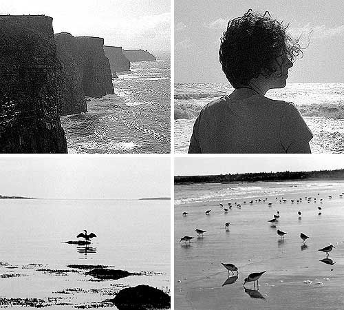 Above: some of my favourite sea photos (clockwise from top right): Cliffs of Moher, Ireland – Sept. 2003; Kerry at the Doolin ferry terminal, Ireland – Sept. 2003; sandpipers, Kejimkujik National Park – Sept. 2000; cormorant, East River, Nova Scotia – August 1999.
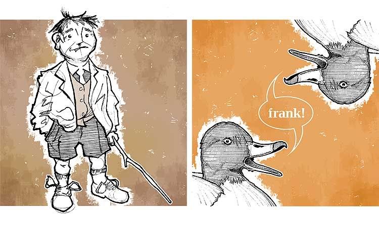
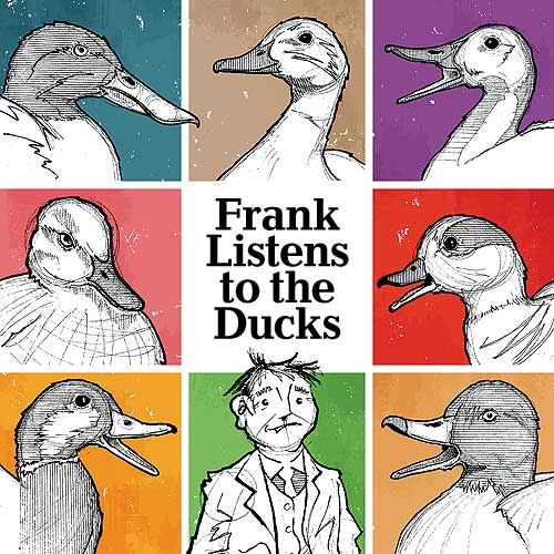 Here it is. Project X – which I craftily offered a sneak peek of with my Illustration Friday submission for 'blue' (click here to jog memory) – is a book that Kerry and I built as a Christmas present for my niece Cadence. All of 13 months old, Cadence may need a few years under her baby belt until she's ready to appreciate it, but we couldn't wait. An autumn brainchild of Kerry's, Frank Listens To The Ducks is a kid's story based on an anecdote my dad told me when I was little. I won't retell the whole story, but I'll offer up this Coles Notes version: Frank thinks the ducks in a nearby park call his name ("Frank! Frank!"). On one of his many walks, Frank witnesses all manner of weird people in the park doing peculiar things: A man dressed in pink, a woman who calls "You're welcome" to herself, a girl pulling leaves off a tree, a grumbling lady, a jogger that winks non-stop. Frank hears the ducks calling and pays a visit, only to find them crowded around somebody else – a man named Hank, who explains that ducks quack different things to different people: Pink! to the pink man, thanks! to the shouting woman, yank! to the girl, crank! to the grouch, wink! to the jogger. Frank learns that quacking ducks are a shared commodity – but still thinks these people are weirdos. These illustrations are in the sequence in which they appear in the book. All were sketched in late November and early December, following extensive sit-down time with Communication Arts illustration annuals for inspiration (after initial doodles failed badly). Sketches were done in pencil, then inked over with Pigma Microns of varying thicknesses. Because I haven't drawn enough to have a style of my own yet, patches of patterning were added using a ruler to keep a sense of visual continuity throughout. Continuity was also aided by using a common background theme of basic colours, type inserted into each image, and a faux-watercolour texture built in Photoshop. The duckies were referenced from slides at work.
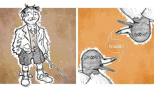 The first two illustrations (above) are of Frank, and a pair of redhead ducks calling his name. The font used with these duckies is Candida. You can click here to get a better look at this pair.
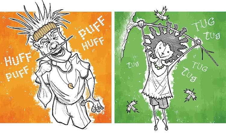
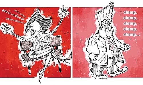 This pairing (above) features the Pink Man and the shouting woman. Pink Man's font is Aachen; the woman's is Ex Ponto. I like drawing fat men in suits. Click here for a closer look.
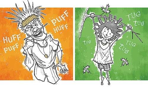 The girl pulling leaves off a branch and the winking jogger (above) were harder. Children are hard to draw; I've rarely done it. The jogger's face was based from a caricature of Geraldo Rivera. His font is a downloaded freebie called Rocky Mountain Spotted Fever; the girl's typeface is another freebie called Sketchbook. Click here for a closer look.
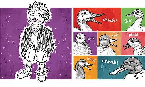 This final set shows Hank and a collage of ducks (above) voicing different words. Hank is a duplicate of the Frank drawing, only mirrored and moustached (done on purpose, not laziness). Clicky here for a closer look. Factoring in a slow work pace, procrastination, printing, cutting and binding (black plastic coils inserted by local office supply joint), the work lasted about four weeks from the time Kerry gave me the copy to the point where it was ready to mail. Copies were also made for my dad and for Kerry's niece and nephew. I have a PDF of the book in viewer's spreads available for anyone who wants a look. Drop me an email (j_wolfe at ducks dot ca) and I'll happily send one to ya.
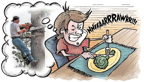
A quickie. There was recent talk on the HOW forums that I inhabit, about the word flavour. Fellow forum haunt Von Glitschka was asking people about the foods they abhorred as children for his submission to Illustration Friday – and natch, some of the same words got repeated over and over: Brussels sprouts, liver, mushy peas. Broccoli was mentioned specifically as a terror for kids, but that's a known fact by now. Even the President has been openly vocal about it. The word got me thinking though – about the flavours I hated and liked as a kid. I hated fried onions (still do). I hated the giant two-ton sack of puffed wheat cereal my mom would buy. I hated rice pudding and raisins in baking. When I was very little I hated pizza, and would opt for spaghetti whenever the family went out for pizza. Nobody seemed to mind. But I liked all those despised foods mentioned above: Brussels sprouts, liver (chicken livers, especially), mushy peas, casseroles ... even broccoli. I ate my broccoli so fervently I pretended I was cutting felled trees with a chainsaw. And sometimes I even made the noises for it. Side note: I tried out the Pigma brush pen I bought awhile back for the first time. It was a little clumsy working with it, but the thicks and thins it provides are kind of cool. I might rework the quickie colour-work added to this one; I'm not that tickled about it. I may change it down the line.
