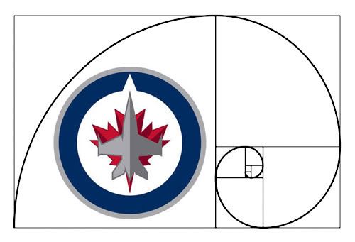
There's been inevitable discussion among designer circles over the identity of the newly-refueled Winnipeg Jets. And for those equally passionate about both design and hockey, it's placed us in an awkward spot. Who do we pledge allegiance to?
My eyes are admittedly clouded somewhat by fandom. I can’t help it. I grew up watching the Jets, while also learning the skills of an artistic and creative trade. Travel back to the mid-90s, and my gangly 15-year-old self could polish off a pitch-perfect hand-drawn facsimile of the Jets' last active emblem. And before I ultimately pass judgment on the reincarnation, I'm willing to wait out the logo's most crucial test: its application on a uniform. But early on, I also can’t help but appreciate our new logo (asterisk at the ready, I pronounce this knowing full well there’s a little matter of the pro-league passable secondary creation, and that tertiary, wince-inducing script monster – we’ve all seen it, I’m not even going to show it, and you’re welcome).
Where this pleasure derives from, I’m not quite sure. The logo takes some of the basic principles of design and tosses them mercilessly off a cliff – and yet, if I passed it in a dark alley I’d probably smile and say hey, new Jets logo, what’s up, and be merrily on my way. Why can’t I just deride it outright, like a good designer should?
Perhaps because I know the baggage that comes with any union of design and sport.
When it comes to design – unfortunately for most of us – pro sport maddeningly abides by its own set of rules. It's frequently an uncomfortable blend of popular taste and crass commercialism, with a healthy dash of Vegas-style pomp. Team crests deemed classics are precisely so, not because there was any greater affinity for design in the good old days, but that there's been time for an entire culture to surround them. Like the BMW roundel or Coca Cola's loopy script, emblems of the Original Six have existed since before most of us were placed on this Earth – and because of this they are widely deemed iconic. Untouchable. The standard from which others are measured.
Consider the New York Yankees – owners of one of the most valuable and storied franchises in all of professional North American sport – represented through the years by an awkward, imbalanced union of N and Y. Then, hypothetically, consider the Yankees starting fresh in 2011. Would the my-kid-could-draw-that amalgamation of N and Y fly with fans and designers alike? Doubtful. But that's also baseball. In a sport symbolized in recent years with an asterisk, Major League Baseball operates – from a design standpoint – in an altogether separate universe (though tell that to the Blue Jays, whose new-ish script puts the Jets' wordmark to certain shame).
Early indications show generally positive reviews from the only folks that, in the eyes of the NHL and True North, ultimately matter – so I shrug my two shoulders and thank high holy bacon the powers that be didn't deliver unto us the next incarnation of the Mighty Ducks logo. On the surface it looks like I’m settling, but I also suspect that many designers in town who know a puck from a hole in a beautifully minimalistic white wall are thankful we didn’t get saddled with a mark that’s out-and-out embarrassing. Hey, the thing’s symmetrical. It’s got a subtle, understated colour scheme. It’s mascot-free. And it’s not awash in flavour-of-the-day gimmickry.
Are we led to believe then, that the line-ups around the block for a first crack at official merchandise equates to an endorsement of the design? Had the emblem been a Lightning-style travesty or nouveau-New York Islanders laughingstock, would the line-ups have contained flaming pitchforks over cash-fattened wallets? Probably not... too much. Any pessimistic bone in me thinks most folks in that line are giddily blind to any aspect of the design. But the fan in me is appeased for now. And the designer in me is glad we’re not stuck with the Coyotes, or the Canucks, or the Penguins, or the Hurricanes, or the Sharks...

6 comments:
Thank you for mentioning the wackness that is the Lightning's look. That's been awkward from day one. Their recent change is still awkward, even if it's a slight improvement.
Ack! Is that Coyotes one for real?
It used to be, I think, until only a few years ago. That made Winnipeggers cry extra hard, back in the day. Salt on the wound.
I am kind of with you. The main logo is okay. Nothing amazing but not really laughable either.
The script ... well, I can deal with it. Even though the J to e connection is wacky, but not jarring (to me). However the t to s connection, is just horrible.
I hope the secondary logo stays a small shoulder patch. But I have a feeling it was designed with t-shirts in mind.
Like you said the true test will be the final package. I hope the jerseys are simply a solid field with stripes. Not the goofy colored panels and piping. I think a dark blue or red would be nice. Instead of a white a I think a grey sweater would look good and different. But since I think the Jets started the "white out" I am sure they will be white.
Some mixed color gloves would be cool. But it might be hard to look unique withe the Habs, Caps, Rangers and Blue Jackets all with similar multi-colored gloves.
I am just happy Canadia has another team.
Excellent post Jeope. They definitely played it safe and it turned out alright. I like that they kept the Blue/Red/White colour scheme and didn't go in the direction of some of the other examples you mentioned.
Now we just need to get that first home game here...and the actual player uniforms.
Yeah... "safe" is a good choice of word for it.
Post a Comment