
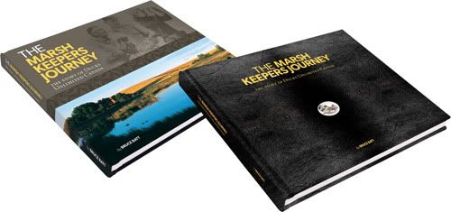
Above: Hardcover (left) and leather-bound edition with inset coin (right).
Until our flesh-and-blood baby arrives later in the winter, current "baby" status has been pinned to the commemorative history book I designed to celebrate the 75th anniversary of the company I work for. The 272-page tome is, by far, the single largest project I've tackled in my professional career. The project used solid eight months from conception to completion, roughly 550 man-hours of time, almost 100,000 words, over 20 rounds of revisions and at least a couple decent freakouts to ship one 3.4-gigabyte PDF to the printers in July.
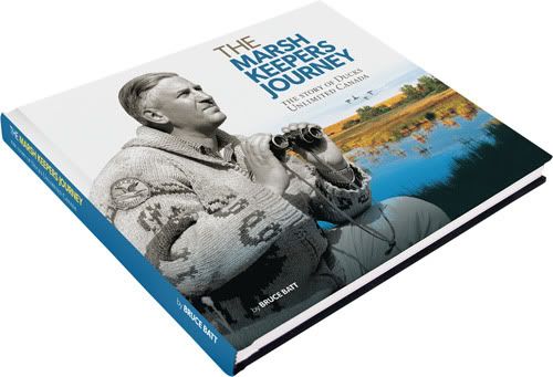
Above: I lobbied hard, but alas, a scrapped cover concept.
Though large in scope, a solid design structure was established early and the book design flowed smoothly after the first hundred pages or so, becoming a fairly efficient operation as the production schedule was ramped up during the later stages. Considerable time was spent in the company library, poring over suitable archival photos and documents, then scanning and cleaning images in every worn-and-torn format used by mankind from the 1930s to present day. It was interesting to see and compare the level of care put into the photography during the first half of those 75 years, versus the hideousness of the Polaroid era and the full-flash, everyone-has-a-camera 1990s (the 1970s and 1980s were particularly hard – as rough shape as those photos were in, the fashion sense of people was far worse).
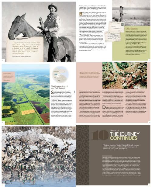
Above: Six of the 272 pages, sized so small you'll need to buy a copy of the book to read 'em.
For such a large project, the crack squad assembled to produce it was thankfully kept quite small: in essence, an author, an editor, a production manager and a designer (not to discredit the multitudes of other contributors involved in providing input and advice). An unfortunate perfect-storm scenario arrived in the spring – when I was gone for a month while the project reached a crucial production point – and I was hard-pressed to consider which outcome was less appealing to me: exhausting the global supply of midnight oil to play catch-up, or handing the book off during my absence. A schedule was crafted that could accommodate the former.

Above: Editor Meg and I squeal, the day the books arrive.
The author is a scientist (and essentially, the client) and we were on board early with the realization this book would be academic, orderly, grid-based (my words) and without too much "designerly fluff" (his words). A muted palette of primary colours (plus green) was matched with shades of warm grey. Typefaces selected were Gibson (gotta support the team) and Bembo, with Pompadour used for chapter numbers. A vector pattern by Von Glitschka was used sparingly for page accents. Colour was also supplied through photography, as selected images gained more and more vibrancy as the chronologically-arranged book neared its present-day wrap-up. But I'm a fan of strict organization on the printed page; I've been at this 14 years and can't deny it now. This book is ultimately a reflection of that.
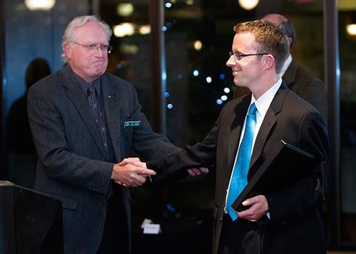
Above: A happy ending in Calgary. Lookit me, I'm wearing the suit.
Now for sale, the book was produced as two editions: a hardcover version with dust-jacket, and a leather-bound issue with inlaid silver coin from the Royal Canadian Mint – which I sorely wished I could have also played a role in, but the government, I figure, doesn't like folks touching their stuff. The book was officially launched late in September at a function in Calgary, where our small and dedicated team was feted.
I'm proud of this book – but it's left me hungry, too. It's hard to return to meat-and-potatoes work. For all its trials and tribulations, I'd do it again in a heartbeat.
8 comments:
Congratulations on the book! It looks terrific onscreen; would love to see a copy up close. It must be so rewarding to see a project like this realized.
It really was, Claudine. I don't suppose you have any books kicking around that need designing, do you?
I am blown away, George. Blown!
Beautiful work, Jeope! Thanks for the intro to the Gibson typeface—it's very nice. I look forward to obtaining a copy.
Congratulations! What a great visual reward of a job well done! Nice suit, too, by the way! We'll have to get a copy of your book next time we're in the country.
Badass, dude! It looks amazing.
Thanks, er'body. It means a lot!
that is amazing, J!!! wow. nice work. i'm impressed.
Post a Comment