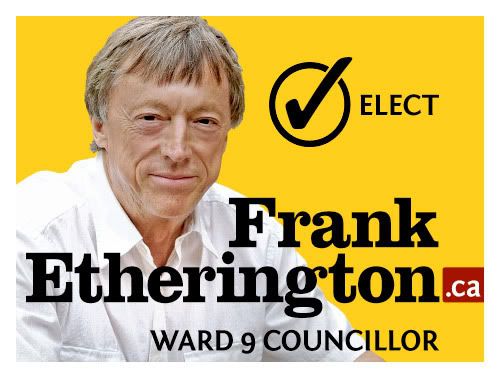
This past fall I applied my design skills to a fantastic cocktail of social betterment and blatant nepotism by crafting the visuals for my dad's first crack at public office, a position on city council in my long-long-ago hometown of Kitchener, Ontario.
We risked the handlebar-moustache-by-Sharpie treatment by the graffiti set and rolled out an array of materials featuring his familiar mug, which, previous to his political career, ran in the city paper week in and week out during his many years as reporter, editor and columnist. Thus, the image was a brand not to be trifled with.
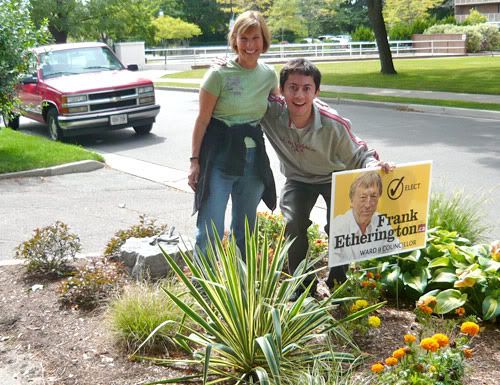
To avoid affiliation with major political parties, many colours were nixed from the get-go. In the end, a combination of yellow and dried-nosebleed red – one of my all-time favourites – was incorporated into brochures, leaflets, leave-behinds and lawn signs (above, and below).
Typographically then, which way to go. Hobo? Too hippie-dippy, wavy-gravy. Impact? Too lock-down conservative. Helvetica? Too Swiss. Comic Sans? Too self-destructive.
Clarendon. It works for Jeopopolis – check the banner, see for yourself. The slab-serif face handles dual roles delicately: its serifs keep things personable, while still conveying the strength and doggedness of a long and well-respected journalistic career. Toss in Fontin Sans, crafted wonderfully by Jos Buivenga's exljbris foundry, to support the cause and I safely feel like I've performed my civic and typographic duty.

I'm pleased to announce, the materials were a huge success. Or, in more accurate terms, success enough that he won the council seat by a single vote, 1689 to 1688 – a margin that ultimately stood up despite disputes, recounts and ensuing court battles. It's lesson enough, that the ages-old credo that every vote counts should remain valid.
Good design wins, by a nose-hair.

2 comments:
It was very brave of you to leave the nose hair in the photo. A lot of people would have photoshopped it out.
Honesty is the best policy. Even in matters of Photoshop.
Post a Comment