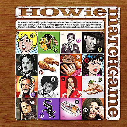
The first page Kerry and I came up with was just a goof-around (above), a game to play for the fortunate folk who get the book. I won't go into detail on account of spilling any beans on how to solve the dealie. It's basically a plain ol' matching game based on the zine's theme. The font, one of my current favourites, is Clarendon.

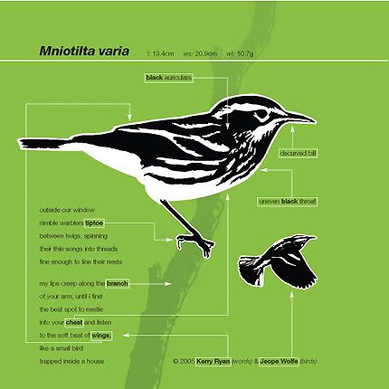
Our second page (above) gave Kerry an opportunity to flex her poetic muscles, and me a chance to play around with what I love best: birds. This field-guide-inspired number, crafted in FreeHand from rough sketches, features a black-and-white warbler, broken down to two tones and kept super-simple with Helvetica.
Here's Kerry's featured poem. It's very sweet.
outside our window
nimble warblers tiptoe
between twigs, spinning
their thin songs into threads
fine enough to line their nests
my lips creep along the branch
of your arm, until i find
the best spot to nestle
into your chest and listen
to the soft beat of wings,
like a small bird
trapped inside a house

4 comments:
like your page jeope, it odes infact stand out.
but i am afraid i am struggling with the game.
Odes?! - does
(sigh)
Right on! Way to stand out in a crowd! I have to admit I jumped on the greyscale bandwagon but I had sound reasoning for doing so. Nice work.
I haven't received my zine yet (Pattie told me she mailed it today though) but I can't wait!
I loves me some Clarendon.
Post a Comment