Recently I was fortunate enough to be selected as one of the fifty-or-so volunteers to create a piece of artwork for a design book to be published next year. The book – untitled so far – will be printed by HOW Books (F+W Publishing out of Cincinnati), with page spreads displaying a raw texture image on the left hand side and a design or illustration on the right that utilizes it – all based off of real-world surface and organic textures collected by Oregon designer/illustrator (and soon-to-be author) Von Glitschka over the past three years. The book will serve as a resource for designers and illustrators who wish to integrate textures into their work, and will come with a DVD featuring the texture files and brief biographies and contact info of the artists involved.

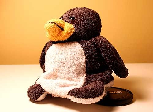
Also being submitted for Illustration Friday's theme of portrait, my contribution is a 100 per cent digital illustration of the plush penguin that occupies a space on my bed (and if he looks familiar, some of you may remember him from this old Valentine's Day post). While the option was there to create something handmade and apply the texture digitally, I started directly from a photograph (above) taken at my desk. To capture a noble pose, I had to prop up the otherwise surly-looking penguin with my lens cap.

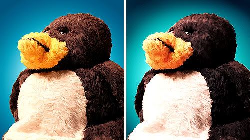
The photo was then cropped to portrait dimensions, and the background was removed and replaced with more complementary tones. From there, a lengthy session with Photoshop's smudge tool simplified the penguin and helped begin the process to make the portrait less photographic (above left). A second session with the smudge tool, as well as various subtle hue, saturation and contrast shifts and sharpenings brought the image closer to completion (above right).

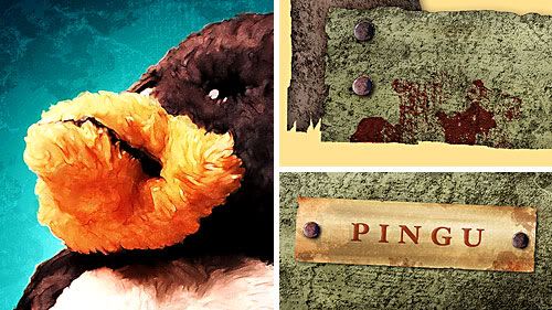
Once at this stage, it was time to bring in the texture. The texture file assigned to me featured a multitude of possibilities, in some parts resembling wood grains, while in others appearing like rust blotches and rock patterns. I used different portions of the file to age the portrait, add highlights and help mimic a painterly style (above left). From the woodgrain-esque areas of the texture file I was able to create the portrait's rough and worn wooden frame from scratch with various overlays of colours and gradients. The title plate was created in a similar fashion (above right), though blurred slightly to appear metallic. Even the brown stains on the frame (above, top right) were created using the texture file, by clipping a ragged swatch of it and creating a custom Photoshop brush. Only the nails – copied over from another photograph of my own – were not altered using the assigned texture.
You can click here for a closer look at the finished image.

20 comments:
did you really do all that work with the smudge tool? damn! that's hot. Wonderful illustration, and thanks for sharing your process.
Gotta love textures :)
It rocks! You just amaze me with your creative mind and skills!
it is amazing how much work you did on it. It is a very good image, I like it.
I enjoyed your IF "portrait". I like when an illustrator includes the steps it takes to complete their work. Thanks for your comment on my IF entry, as well. :-)
Both the image and frame are very beutiful, and well done. I'm just not sure I like them together.
The book sounds a great honor, and one I'd like to buy...
oh wow.. i completely didn't recognize your work here...how fun! good job.. and thanks for turning me onto Sugar Frosted Goodness.. :)
I love it. He's a fluffy peguin!!
Wow, the textures rock ! the penguin is very cute also...I love it !!!
Thanks, people. And I see your point, illustrationblog; I did get carried away with the assignment, wanting to try so many things at once.
HE! HE!! Sooo CUTE !! love it!
Wonderful! Really adorable :)
what a wonderful illustration… congrats on the book inclusion… and thanks for sharing your process…
Very very nice! Cool project to have in a book. I just want to hug him and squeeze him and call him George-oops I mean Pingu too. Cheers!:)
He's a wierd guy, had me wondering whether it was photo or paint. Thanks for the talk through on how you did it. End result is great and I like the way you get texture in your work.Thanks for your comment on mine, look forward to seeing your next one.
It looks great. Just shows how much I need to work on my photoshop skills.
Fantastic! I love this Jeope. Everything about it. I would buy a print and hang it in our play room. :) My daugher watches a show called Pingu. It' so cute. I THANK you so much for taking the time to explain how you developed this piece. It's like sharing your secrets. I"m very appreciative of the step by step explanation. ~ See you in Vegas! :) Ha!
love this! :)
Your writeup completely enhances the appreciation for your piece. The process is one of the more interesting aspects of art and you have quite a bit of that.
I can't wait until these books come out and I can buy them and be all like "yeah, I know this guy...."..... :)
I love how you made little pengu even fluffier looking. Very nice.
Post a Comment