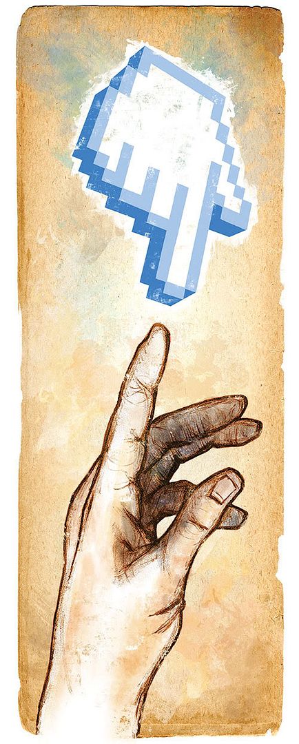
Illustration Friday's brand-new theme of skinny allows me a chance to show off a brand-new freelance illustration endeavour. It also sends me spouting off about blogs' inabilities to showcase or scroll long and skinny horizontal pieces (like comic strip panels and stitched panoramic photos, which I love to build). But on this matter I digress.
Recently I was afforded the opportunity to craft a unique illustration to support a one-pager article in a new magazine being published by Canada's National History Society (makers of The Beaver, a time-honoured Canuck literary tradition). The magazine, Teaching Canada's History, unveiled last week, is being distributed to educators and will also be available at newsstands.
I, of course, delayed any decision to show the piece until following the launch. But as a freelance assignment it was a fun challenge and a chance to work with tall and skinny pre-set dimensions that I’ve taken advantage of with previous Illustration Friday themes like this, and this.
The article called for a support piece that dealt with themes of history and technology, and connections between the two. Wide open skies for an illustrator, and among presented rough concepts to the client is what you see here, with the connection being shown quite literally (in the blue corner, representing technology, the cur-sorrrrr!... and in the red corner...). Also called upon for divine inspiration were Michelangelo’s doodles in the Sistine Chapel.
The hand, based on the hand of Adam, was drawn using soft pencil and charcoals; the cursor icon was created originally with pens and a ruler, then coloured and tidied up digitally. Amalgamation, background texture elements and distressing were all finalized in Photoshop. The final piece measures roughly 3" by 8" – and I do enjoy drawing skinny, so thanks, Canada’s National History Society! And thanks, Illustration Friday!

4 comments:
An imaginative, and creative illustration on so many levels. I love the texture and the edges of the background along with the entire concept.
interesting concept and very nice execution! love the hand drawing and the texture how it contrasted with the digital cursor.
well done!
Very nice illustration, and thank you for explaining how it was done.
What a fantastic juxtaposition. Love it.
Post a Comment