Showing posts with label illustration. Show all posts

January 10, 2015

Draw!

Drawing Night I
Time out from writing. I spent last night sketching instead, with friends – and their incredible burgers – at The Tallest Poppy (my stars, so many good things right there in one sentence). A fluctuating crew over the course of perhaps a half-dozen outings in the last couple of years, it's been decreed we amp up our number of events. Hopefully, the next one happens sooner than three months away – we'll make it so. We've now been labeled "The Draw Mob", so the pressure is now on to live up to the moniker.

Drawing Night II

I drew a pair of quick jobbies during the beers and banter. One sketch, entirely inspired by current weather patterns. Another, purely for the sake of drawing a dude chowing on a chocolate bar (and decidedly non-seasonal). These were completed with a black brush pen and some grey markers in my minuscule 4X6 Tintin sketchbook.

October 01, 2014

286: Inktober


My close friend Allan Lorde tuned me into Inktober, a drawing/sketching exercise created by Jake Parker and performed by illustrators all over the map through the month of October. Having drawn a grand total of four things this calendar year, I announced I was in before I even knew what I'd said/typed. I'd completed a similar assignment a few years ago, sympathetically hitching onto Kerry's poem-a-day-in-May challenge by spending time each day completing a sketch. It achieved great results; my drawing instincts were noticeably improved by the end of one month. So, why not do it again? And the pen/ink caveat laid out by Mr. Parker is as up-my-alley as anything ever will be, illustration-wise.

What to draw, though? Anything and everything. I figured I'd grant myself a maximum of one hour each day this month to come through with some sort of output. Some days, I imagine will be less. Some may be more, like this rhinoceros, where I had the opportunity to dilly-dally while home from work with a throat infection.

How come a rhinoceros? That's my own added challenge. Kerry and I are quickly losing track of Scout's ballooning vocabulary, so I've decided this month to draw 31 things that she can recognize. I finish inking a sketch, hand it to Scout, and if she correctly identifies it – I know I've done a successful job. Many of these things I'll also have never drawn before. Like a rhino. This is my first-ever rhino drawing. Scout ID'd it like a tiny boss.

June 01, 2013

281: Aboo

aboo
Scout broke our brains today. It's not been the best spring outside this year, and I think she senses it – especially after we'd made all manner of wild promises and vivid descriptions of this thing called summer. Tonight she finally called bullshit and let us have it – and with cold, wind and rain hemming us in from outside, we had no choice but to cower in the attic on our Pilates ball as she howled.

It's my duty to get Scout to sleep for the night; it's the closest thing I have to a magic touch. First Kerry induces her into a 'milk coma', then I wrap Scout in her pod (a nice way to describe what is essentially a straight-jacket). Tonight the coma did not happen, and I set to the laborious procedure from scratch, of getting her from crankypants to conked. She wailed, flailed, and then – as if declaring truce – she halted her fit, gazed at me and mewed aboo. She relaxed, and was out cold a few minutes later.

Scout's aboo is among her cutest accomplishments in life. It happens every now and then, often while being held. I immortalized it in ink, in this doodle I created for Kerry's Mothers Day card – the only bout of drawing I've managed in the 105 days since she's arrived on the scene.

December 17, 2012

274: The Icicle Thief

the icicle thief
We spent time this summer building a slideshow in honour of Kerry's parents' anniversary (me: scanning and designing; she, sneaking and supplying from their archives). We came across a photograph from the early 1980s of Kerry in her snowsuit, sucking an icicle outside of the family cottage. While it struck me as merely adorable, I realized when the first snow fell this winter that the photo would serve as perfect reference material for this year's Christmas card.

The image itself (below) is very pleasing. The clothing and film grain suggest a different era, but one not so long ago. In these wintry parts warmth still overpowers style for small kids – parents will, ideally, see to that until the end of time – but the utilitarian navy-blue suit with yellow striping has been largely replaced by shock pink and chichi snowboarder chic. I fear sometimes that icicle-suckery will go the way of tree-climbing and playing outside until dusk. I hope this isn't so, and I'm doing my part: I sucked on an icicle a few weekends ago while cross-country skiing. It was satisfying and thirst-quenching. And I hope that, one day, our kid will also suck on icicles.

Photobucket
Our Christmas card also doubles as a submission to Illustration Friday – which I haven't partaken in for some time – for their theme-of-the-week of snow. For those checking in via Illustration Friday, thanks for stopping by; this piece was drawn exclusively with a black Pigma brush pen, then scanned, coloured and stylized in Photoshop. You can click here for a closer, more detailed look-see.

December 09, 2012

273: Mo Money, Mo Monstaz

Photobucket
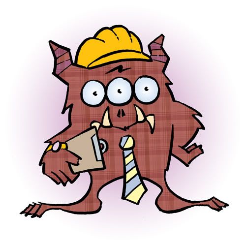
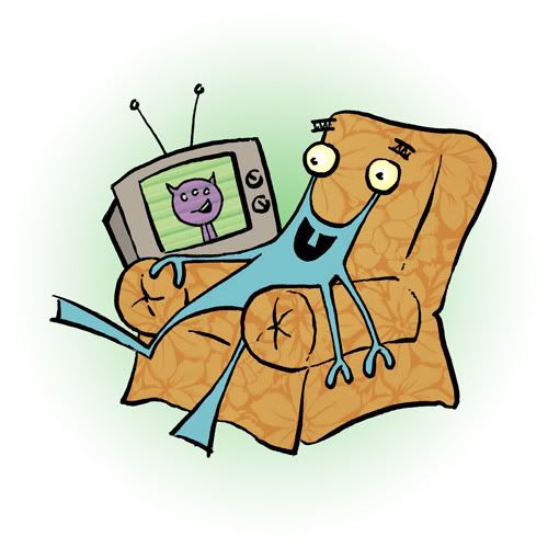
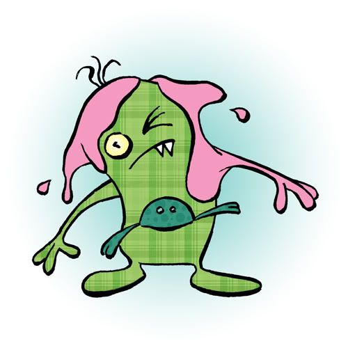
I recently completed a large freelance illustration assignment, a second go-around with three monster characters I'd developed for a local agency in 2011. The work was spread out over the summer and fall, and was a rewarding experience to reacquaint myself with the characters after more than a year apart.

The biggest difference this time was not having to develop characters from scratch, and in this sense it was like sliding my feet into a comfy pair of slippers. I was able to continue developing and exploring the characters' personalities, and their limits. And from a purely structural standpoint, the monsters were released from full-page comic-strip panels they'd been largely constricted to their first time out, in favour of more floating, spot-style illustrations and other 'border-less' scenarios. 


Photobucket
This became liberating and, combined with a greater familiarity and confidence in drawing the characters, made for a pretty smooth (and fun) ride. (A side note: the basic colouring and texturing done here was for the purposes of offering some vibrancy to this blog post. In reality, I handled only the character development and inking.)

I'd mentioned it the first time around, that I found myself gobsmacked at the prospect of drawing monsters for money. Completing this job has me closing my eyes and smiling at the very idea of it.

Photobucket

April 07, 2012

265: That's A Paddlin'

that's a paddlin'
My brother and his fiancée are getting married later this year. As part of the preparations, they asked me to craft their über-simple invitation that would take the form of a postcard featuring an illustration of the two of them in their "engagement canoe". They were angling for a look very similar to a self-portrait I'd done a couple of years ago as an homage to Hergé, one of my few select illustration heroes. The style, all crisp, defined lines and doses of flat colour, was right up my alley. So as daunting as it was to honour them and their big day – almost as daunting as the invites for our own tiny, perfect wedding – it was a request impossible to say no to.

One hitch: with the ask coming during the onset of winter, reference material for a soothing paddle in the water would need ample assistance from my imagination. So in its place, the equally soothing sensations of a faux-paddle through the snow in a neighbourhood park…

Photobucket
The postcards are in the mail now (we've got ours!). All that remains between now and the big day is that pesky little matter of summer.

Click here to have a closer gander at the finished drawing.

March 29, 2012

264: The Leaf Charmer

the leaf charmer
This was fun. This fellow and his leafy prey is about an hour's work all-told; output from last night's meetup with good friends Allan and Chris at Pop Soda's Coffeehouse (and brief after-party at my pad). The three of us had hooked up on a couple of other man-date occasions to talk shop – and decided for "ManDate III: The Reckoning" that there would be instruments of sketch destruction involved. It was some mid-week loosey-goosey catharsis.

As to where the idea came from for the drawing, I have absolutely no frickin' idea.

Check here to see a more detailed look.

March 27, 2012

263: The Music Man

the music man
This illustration – as a sketching exercise – goes way back to those hazy, crazy days of the summer of 2010. I signed up and vowed an online pinky-swear with my American friends Melissa and Amy to try a little exercise in collaboration. Each of us would blast out an hour of sketching with some Pigma Microns, filling roughly one-third of a page, then mail it on to the next participant. Then repeat, and pass it on again. The end goal would be three filled pages, with illustrations shared and completed equally among the three of us. Easy-peasy.

Except that after two rounds of play, life set in and the exercise disappeared into the ether. I can't even remember what happened on my end of the deal, with the third piece, to let it sit on my desk for an eternity and a day. But fast-forward almost two years when, during a cleanup of my drawing space, I came across the incomplete final installment.

And I thought, nuts to this, finished the thing and mailed the finished three-person creation home to Amy in Arizona. I'm also holding fast to the assignment's original rule that no one finished piece be displayed until all three return to their humble place of origin. But in the meantime, here's a rejig of my original drawing that got it all started: a one-hour pen drawing of Canuck gadzoople-threat entertainer C.R. Avery, who I saw at the 2009 Winnipeg Folk Festival – run through the Photoshop-machine.

Click here to nab a more detailed look.

March 20, 2012

262: Drawing The Shades

collect all four!
Kerry and I bought ourselves an introductory class in letterpress and bookbinding techniques at Winnipeg's Martha Street Studio for Christmas. The sessions began later in January, just wrapping up last week. It was an invaluable experience for myself – I've always wanted to plant my butt at Martha Street and get dirty doing something decidedly un-digital. That it was something the two of us could share made it all the more sweet. The place kicks ass.

The basic bookbinding stitch techniques we learned bent my brain into a pretzel – always a sure sign that I'm learning something. I'm now unashamed to admit I had never needle-and-stringed anything before, beyond coasting through one term of a junior high home-ec class on charm and procrastination. Though I didn't exactly master the skill, I can at least be a tiny bit pro about it now and say hey, the stab stitch is my favourite stitch.

I was more enamoured with using the ink, chase, quoins and other old-timey tools of my trade with the presses. Again, all very basic stuff in this class – which was ideal. Scrounging through the studio's trays of type I found a face I liked, and set to work making these flash-cards – for lack of a better word – to underline yet-to-be-created illustrations I'd create to hopefully match. These pieces eventually became a quartet of simple, geometric – and above all, hand-made – cards featuring two-toned songbirds, shaded in brown and black for Illustration Friday's current theme of shades.

No computers were consulted/harmed/touched/even thought about, in the creation of these pieces.

thrush
junco
sparrow
towhee

March 04, 2012

260: Brushing Up

fatso
Up late-late at night, dickering with a recently-doodled office-meeting doodle and trying out some freshly downloaded freebie Photoshop brushes from Chris Wahl (I think it's set seven, if you're scrolling through his wares). Please click here for a crisper, better view.

And now I am zonked. Good night, all.

February 06, 2012

258: "I Want To Draw A Bird."

Coccothraustes vespertinus
So, when I really want to draw something – and know at the end of it all I want to be happy, I draw a bird. Anyone who's visited here in the past eight years knows this by now. Writers are told to write what they know; illustrators, I'm not sure if they live by this creed or not. Lots do, I'm sure – really good ones don't have to care. I do. I started this site all those years ago to venture forth and see if I had a style. Or could develop a style. And as I drew and drew and struggled and tried different things, I came to the realization it was this, this technique all wrapped up and on display in single drawing of an evening grosbeak. My style has found me, rather than the other way around.

Not to say this drawing is any sort of revelation. It's not. I knew I hadn't genuinely drawn something for quite awhile (as is often the case). When this happens, and I want to make sure I still 'have it', or a semblance of 'it', I draw a bird. It comes to me often like a craving (or a nagging): I want a brownie. I want to get out of the city. I want to draw a bird.

And I get to work drawing the bird. I pencil-sketch it, so lightly you'd think I was confident enough to go straight to pen and ink. I draw a basic framework with a thin-nibbed pen. Go over the more integral lines with a thicker pen, and again with a chisel-tip pen. A patchwork of short strokes in small fan shapes, over and over, and over again, for feathers and texture. Finally, a go-around with a brush pen, to rid the thing a bit of its careful, calculated feel and add some spontaneity. Big, brush-penned needles to cover for my disinterest in adding feet (yes, even with this amount of detail there is laziness peeking through). Then, I scan and I colour.

Photobucket
I've also noticed over time that many of the birds I particularly enjoy – and enjoy drawing – share similar characteristics, textures and tonal ranges. That might be the designer in me talking, but I made this Kuler-style chart anyways, and realized it was the case.

January 12, 2012

256: Grounded Down

Photobucket
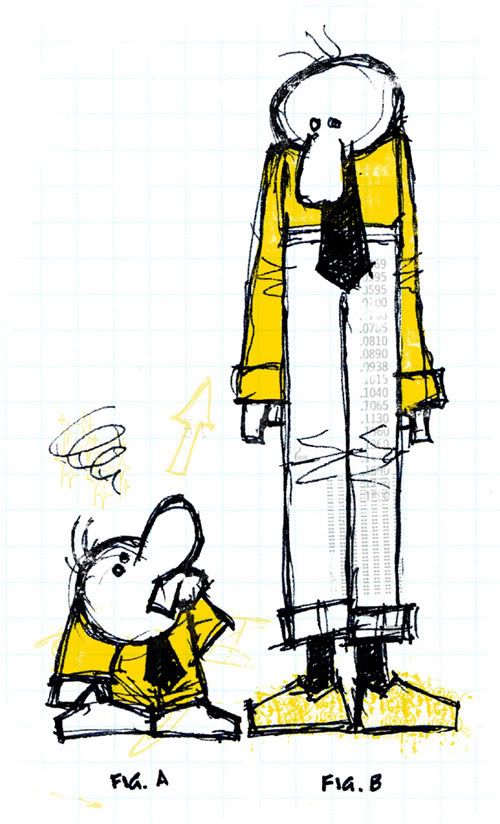
In a concerted effort to prove to myself that any drawing can be fruitful drawing, I'm posting this doodle. Doodled among other doodles during a department meeting at work yesterday afternoon, I scanned and brought these fellows home, where I proceeded to meticulously transform them into an ever-so-slightly more interesting doodle. And then, respectfully submitted to Illustration Friday to also exemplify their theme-du-jour theme-de-la-semaine of "grounded" – showcasing the unfortunate reality that some people are genetically more, um, grounded than others.

November 21, 2011

253: Vanity In Purple

vanity
I sketched this portrait of my now-seven-year-old niece (holy crap, it seems like only yesterday) in fits and starts over the last few days. 

I am rusty. It took me more than a few do-overs to arrive at the basis of something I could continue with. The source material was never in doubt: an incredibly brief moment I captured earlier this past summer at the beach. The reason for this epic pout long since forgotten, it's still a universal expression all kids learn to master – whether it works or not in getting what they want.

The layerings of purple, added digitally, come from an altogether different source of inspiration: my friend's three-year-old daughter who, like three-year-old daughters across this earth, is enamoured with all things purple and pink (despite her parents' consternation). But as the pinky-purply wash continued to accumulate, the more it began to take on overtones of summer storms around these parts – some of which even come close to matching the power of a little-girl tantrum.

Midway through creating this thing, Illustration Friday – that one-time bastion of inspiration for me in keeping this blog running – dropped in my Friday inbox their current theme of "vanity". I haven't dropped in on Illustration Friday in a year and a half, but am including it here since the whole creation would not have happened were it not for the brief moment of pouty vanity that inspired what you see here… which, you can click here, to see even bigger.

September 28, 2011

250: Don't Do What Donny Don't Does

no luring, baiting or feeding wildlife
I squeezed in a recent fun bit of freelance illustration for a poster concept, and while I hesitate showing the whole thing, these two excerpts were the best part – and an opportunity for me to get in some much-needed drawing time. The task was to illustrate four basic rules supplied by Parks Canada for tourists to abide by while riding the giant Tundra Buggies out of Churchill. I had nowhere to go but up; current "posters" plastered about the buggies are laminated letter-sized sheets simply listing the four rules aided by a bear silhouette.

no depositing garbage or littering on the ground
Pretty straightforward: don't litter. Don't harass the bears, or lure the bears. The fourth rule, though – no using devices that enable cameras to be placed under or beside vehicles – seems oddly particular. I was told this happens; enough obviously, for a rule. The buggies are high, I know that. High enough to keep juicy tourists out of reach from Earth's largest land carnivores. Remembering that ultimately this required sign-off from government, I shelved concepts involving a fishing pole or elaborate steampunk contraption, and rolled with my big-schnozzed fella simply dangling a camera tied to his scarf.

July 03, 2011

245: Incorporating Monsters

hug
I haven't been drawing a lot lately. And the chief reason for that is, I have been drawing a lot lately.

This spring I've been pumping up my freelancer muscles. That is to say, I am in the process of acquiring freelancer muscles, having, for years, not been very interested in the concept of work outside of work. How things change.

The bonus of it all is, of course, financial – otherwise, none of us would be doing this. But also, in the two-birds-with-one-stone category, I was able to overcome a massive lack of drawing following a year or so of taking photos. (Conversely though, these days I do not take many photos.)

So in the theme of work staying work, and this blog staying primarily about fun, I present a crossover of sorts, taking myself to a rarified place where stars and planets align, work becomes fun, and fun becomes profit. These two close-knit fellows above represent two of three characters I developed and incorporated into a weeks months-long freelance operation – one that was ultimately pretty darned rewarding. Having previously not spent so much time working away from work, I only needed to remind myself – which I did quite often – that here I was, at my desk with my pens and light table, drawing monsters for kids, and getting paid for it (soon).

It had been a long time since I reflected on my career choice, thinking mebbe I am on the correct path. I like to think these critters had something to do with it.

March 04, 2011

240: Down, But Not Out

Welcome to the redesigned, re-purposed – and re-dedicated – Jeopopolis!

(I feel myself saying this as much to you, as I am to myself.)

So, how's tricks? I must say I found that without a blog to kick about, I started to get a lot of shit done. Ventures that took time and some patience, a virtue I was not expressing well in the assembly-line of posts being rung up here week in and out. I started to like not having to think about it; frighteningly, a little too much on some days. Other days, I forgot the site even existed. Sometimes people would ask me about it, but I didn't have answers. I figured the time would either come, or it wouldn't.

The blog, it was becoming an albatross around my neck – a neck neck-deep in a time-sucking, energy-tapping photographic opus and a desire to let this site sit as long as it took to become compelling for me again. Which, I'm happy to report, it now has.

And I've got an awful lot of catching up to do, a lot of work and fun to document. There's been a welcome infusion of freelance work. The launch of Kerry's second book, a major moment in her literary career that I shared, in my own tiny way, by living out my own professional fantasies as book jacket designer. And there was the matter of that photo-a-day project; it's no mystery by now I completed it, officially kicked its ass, displayed it to the world with my friend Karen in a gallery exhibition that closed up shop last weekend.

So for starters, I present a trio of spot illustrations I crafted late in the summer for placement on interior pages of Kerry's new book – titled Vs. – to help indicate chapter breaks. Using old-timey reference photos, I built five illustrations all told, to accompany five short poems detailing the sensations of five different boxing punches.

uppercut
The illustrations ultimately didn't make it into the final layout. It was a downer at first; I was proud of knocking out pieces of work dabbling in material and a style I was quite unfamiliar with. The sketches gave me a good opportunity to attempt some fluidity in my stiff drawing manner (you can click on any of the three images, to view them larger).

cross
I came to the same realization Kerry's editor/publisher did – that the drawings didn't gel with some of the book's central themes. They would have been window dressing at best, and distracting at worst. It was the right call. And mebbe someday in the future they can be rolled out for another use. You never know with these things.
jab

June 23, 2010

237: The Tanager

Photobucket
So, the other day I was in the cafeteria lineup at work next to our resident naturalist (and all-around bird expert, who also leads Friday morning songbird banding, for which my camera and I are most grateful).

In typical bird-nerd fashion, I asked her where I could go in the area to improve my odds of spotting a scarlet tanager, one of the most vibrant and colourful songbirds around these parts. Since my early childhood days of bird geekdom, I've still only seen them in field guides.

She told me, essentially, what I already knew ­ tanagers like deep forest and high tree canopy, largely away from prying eyes.

But it got me to remembering my apartment-dwelling days. I spent upwards of four years in a fourth-floor suite overlooking a city park through the canopies of huge boulevard elms. And every May for a few short weeks, the treetops outside my windows would be filled with brilliant and wonderful little birds passing though during spring migration. Warblers, thrushes, kinglets and thrashers; from street level I'd have had zero idea they were even up there. Probably, much like that elusive scarlet tanager.

I created this digital illustration in homage of my search. I'm often hard-pressed not to look at a big fat tree and think of what's up there, out of sight in the leaves. But they're obviously there. The field guides say so.

This is almost an entirely digital concoction. The bird and leaves are scanned outlines, vectorized in Illustrator. The tree itself was originally a high-contrast silhouetted photo, inverted and simplified. The background is a tinkered-with scan of faux-wood panel. The leaves were repeated in an analogous array of greens, rotated and bunched for copy-and-paste sessions in Photoshop. For a closer look at the overall piece, you can click here.

May 06, 2010

233: JeoJeo: Boy Graphic Designer

Photobucket
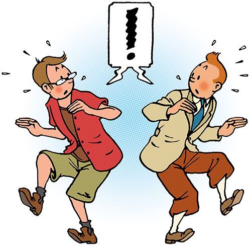
I never experienced the glory of a comic-book phase at any point of my childhood (or adulthood, for that matter). I was left awkwardly in the lurch in high school art class when my friends held competitions to see who could draw the best Wolverine. My only comparable obsession came from reading The Adventures of Tintin books, which were stocked as a beat-up, dog-eared collection in my elementary school library, usually alongside a few copies of Asterix.

Now that I'm all grown up – complete with disposable income – I'm slowly piecing together my own collection of the Tintin series. One here, one there – usually procured at Toad Hall Toys whenever I'm searching for presents for my niece or nephew (or for Kerry). I'm finally coming into my own as a full-blown Tintin geek.

This primarily stems from my absolute love of Hergé's artwork (that, and the fact that any scan of Captain Haddock's furious mug usually makes me laugh). But Hergé's graphic, flat-colour, stay-within-the-lines approach has always had an appeal for me as a sensible, structured and detail-oriented graphic designer. I've long wished to make an attempt at placing a character of myself into Tintin's world, seeing how we share similar dimensions, taste in clothes – often, even the same wisp of hair. And this week, I finally pulled it off.

Click here, for a closer look.

March 16, 2010

229: Subterranean Homesick Owls

Photobucket
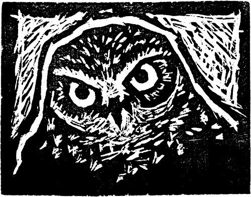
Illustration Friday's current theme of subterranean – very specific, which I like – allows an opportunity to display wares from a weekend spree of woodcut-based monoprints.

Photobucket
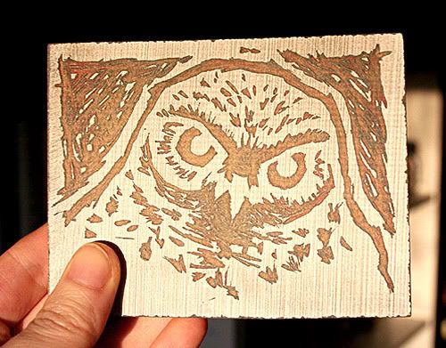
In January, a friend offered me a couple of small blocks of particle-board and some cutting tools to try my hand at carving, something I hadn't really done since high school (on linoleum, I think we all did this in high school). After a few sessions of trial and error, I carved myself a nice little cut of a burrowing owl (above).

Photobucket
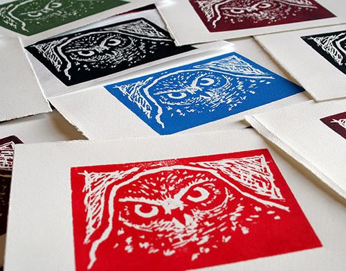
Actual printing went down on Sunday; about a dozen or so decent copies (above) run off on a small but effective homemade press at my friend's place. These I am quite proud of.

Photobucket
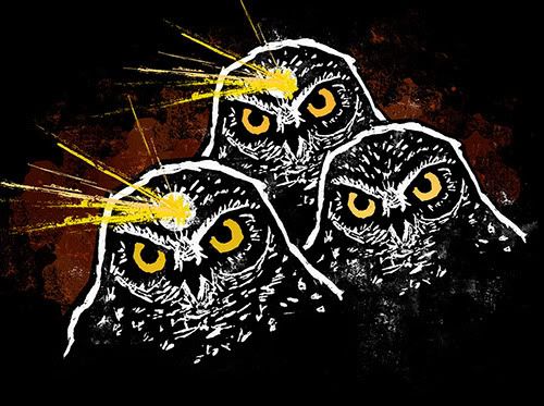
For Illustration Friday's purposes I scanned one of the black-ink prints (above) to further the piece digitally, though I hoped to retain the print's sense of hand-craftedness. Burrowing owls are unique among the owl set for nesting in abandoned prairie-dog dens, among other subterranean abodes, and the stark, confined nature of these prints suited an idea I had in mind. Where the concept – and this write-up – takes an odd turn is in the piece's source of inspiration. Subterranean, for some reason or another, made me recall the mining sequence about midway through Dance, a two-minute animated National Film Board vignette that used to fill space on CBC when I was a kid (any Canadian worth his toque should recognize this tune).

Click here, to view the illustration larger (and on black).

February 22, 2010

226: Portrait Of A Metal Duck

Photobucket
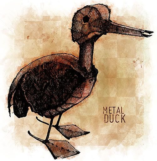
A culmination of the past two Monday night Creative Nights – last week: drawing, this week: colouring/styling – this drawing enabled me to get the pens out and work on some hatch-based texturing. This is a roughly one-foot-high welded metal duck sculpture sent to Kerry and I as a gift some time ago, which I situated at my new drawing desk last week and treated as a still life sketching subject; the sketch itself ended up almost actual size, resulting in a pair of stitched-together scans to make the final image in preparation for finishing up tonight. No theme, no reason, just drawn for quacks and giggles. A larger version, with a look at some of the detail, can be viewed here.