The Winnipeg Folk Festival once again performed admirably in the department of good times. This year's line-up was not aimed directly at my heart (for that, see Folk Festival, 2009). Nevertheless, it was solid. As it always turns out to be. Speaking of turning, this year I opted to record the experience through my camera's rarely-used video function.
Thursday night, and the Preservation Hall Jazz Band had me quite instantly relaxed. Come. Dance with me. Gaze into my eyebrows.
Curses! Before you even get a chance, here's Kerry, stealing me away from you. Together we attempted the Folk Festival four-step. Not the most fluid manœuvre, but the weekend was young. We had plenty of time to hone our skills.
The next night, k.d. lang tore the roof off… were there a roof.
Sunday afternoon. I don't know if it was the heat, or the sun, or the drums, or the brass section, or the masked hula-hoopsters, but I found myself swirling in a whirling vortex of left-leaning, patchouli-soaked crazy madness. I had to be wary.
And then, come Sunday night, we perfected the jitterless double-team spin-o-rama. But at the expense of our very sanity.

July 11, 2011

July 03, 2011
245: Incorporating Monsters

I haven't been drawing a lot lately. And the chief reason for that is, I have been drawing a lot lately.
This spring I've been pumping up my freelancer muscles. That is to say, I am in the process of acquiring freelancer muscles, having, for years, not been very interested in the concept of work outside of work. How things change.
The bonus of it all is, of course, financial – otherwise, none of us would be doing this. But also, in the two-birds-with-one-stone category, I was able to overcome a massive lack of drawing following a year or so of taking photos. (Conversely though, these days I do not take many photos.)
So in the theme of work staying work, and this blog staying primarily about fun, I present a crossover of sorts, taking myself to a rarified place where stars and planets align, work becomes fun, and fun becomes profit. These two close-knit fellows above represent two of three characters I developed and incorporated into a
It had been a long time since I reflected on my career choice, thinking mebbe I am on the correct path. I like to think these critters had something to do with it.
June 03, 2011
500

San Francisco | Fun this way! – by Connie Tsang, aka ardenstreet
I have a difficult time expressing just exactly what it is that makes me 'like' something. Take my time whiled away on Flickr since the summer of 2004 – it has taken nearly six and a half years to "favourite" 500 images on this site, a photo hub boasting well over five billion snaps. Now I am not a snoot; much like Ralph Wiggum, I like stuff – but my storehouse of Flickr favourites is a precious place. It's chockablock with now why didn't I think of that. Packed with I am not worthy. Stuffed with f**k that's funny.
Some pics don't make a lick of sense. There are illustrations flat out jaw-dropping or brain-jarringly simple. Most of all, there are 500 visuals that speak to me. Even while I can't describe to you why this is. But if you ever want to know me, check my 500 favourites.
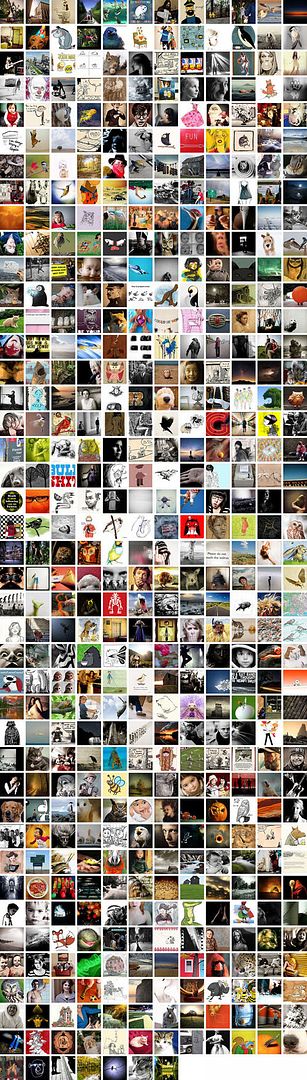
Thanks, Flickr. Click here to view larger.
May 24, 2011
Parks And Recollection

In 1985, my mom took us on a vacation – the family road trip, one repeated too many times to count in this country – to the Canadian Rockies. I was nine years old, had never seen the mountains. Although this experience was checked off my kiddie-size bucket list just south of the border in Montana, it was time spent in the five iconic Rocky Mountain national parks (Waterton Lakes, Banff, Jasper, Kootenay and Yoho) that set in stone for myself a lifelong fascination with our national parks. An oversized, dog-eared coffee table book on Canada's national parks arrived for my birthday soon after this trip, a gift bought with cash sent from my grandparents. I was hooked.

Our family vacation, taken after Labour Day in place of my first two weeks of Grade 5 – on a shoestring budget outside of peak season (kids don't care, and... ooh! the Lake Louise hostel has a pool!) – opened my eyes to the size of the country. Previously, any personal real-life grasp of Canadian geography extended to Manitoban day-trips and visits to my dad in southern Ontario. To his great credit, he took me to Point Pelee to satisfy my rapidly-developing childhood birdwatching jones, and to Flowerpot Island, to witness incredible quirks of geology.

Some of my greatest stick-with-me moments have happened in these places. My Crayolas, melting on our car's dash while I day-hiked with my family in Waterton (I got in shit for that from mom). A four-hour bike ascent to the base of Mount Edith Cavell in Jasper (and 30-minute comfort cruise back down). Beachcombing with Kerry and my mom – and a few hundred migrating sandpipers – at Kejimkujik's seaside adjunct (after sneaking behind the lines of trail closure signs). Leaping to high heavens as a frightened moose crashed from the bushes metres away in Gros Morne. Watching Kerry on the dock at Riding Mountain's Kinosao Lake, the entire scene quiet as a mouse. Kerry and I dropping from exhaustion after our trek to Crypt Lake. Playing park rangers together on a backcountry hike last summer. We would have gotten engaged on Bruce Peninsula, had a thunderstorm not rolled in and delayed my requirement for the perfect moment (which happened the next day in the unholy sanctity of – gasp! – a provincial park).

I sometimes like to think, as well, that the parks even had a hand in my becoming a designer. I quickly became fascinated with the 1980s-era mini-brochures, that visitors would receive on entering any given park, themselves a take on the Unigrid-and-Helvetica materials of the U.S. Parks Service. I collected them, marveled in their continuity. I could draw the old beaver logo from memory, a symbol, in my mind, as much a part of Canadiana as the CN doodle or CBC burst. I'd wonder why the rest of the world couldn't adopt clean, common signage design like the brown-and-gold world inside a national park.

This year, the Canadian national parks service turns 100 years old. And I'm happy about it. There are not too many things that make me as openly patriotic. Gros Morne, Cape Breton Highlands, Kejimkujik, Fundy, Point Pelee, Georgian Bay Islands, Bruce Peninsula, Riding Mountain, Waterton Lakes, Banff, Jasper, Kootenay and Yoho – that's my list. It should be greater, and it will be in time. There's too great a desire in me to watch waves crash in Pacific Rim, scan the expanse (and four trees, total) of Grasslands, or to somehow reach the high Arctic and truly get lost.
May 20, 2011
244: Going Coastal

Kerry and I went to Vancouver last week. I had never been (minus the airport), nor had she since she was a kiddo. Kerry was attending a conference, so for a few days we shacked up in a ritzy, gleaming hotel tower. The hallway mirror told you what the weather outside was like...

While she conferenced, I entertained myself. One day, I hoofed the paths at Lynn Canyon Park. The lushness of the place, I will never witness at home – no matter how long I accidentally leave the sprinkler on. If green was my favourite colour, I would have experienced bliss. As it was, I was content with scenic splendour to bask in. But I tore myself away from the place to join Kerry and see Bill Clinton speak – I had never seen a president before.

I rented a twenty-dollar bike and toured the coastline another day. Having recently received my pre-summer buzzcut, I was unprepared for the potential of a sunny day, and toasted my exposed forehead. It was worth it, even as my face peels as I type this. I located the Go Fish seafood stand, and ate the best fish-and-chips of my life. All told, we ate very well: Bin 941, Hapa Izakaya, Latitude, Burgoo, Nuba – no one disappointed. Toss in a Kurobota Terimayo Japadog, and I was a super-happy eating camper.

On another day, I toured the Vancouver Art Gallery – and got lost in Ken Lum's Mirror Maze with 12 Signs of Depression. When Kerry was finally set free we shopped, before striking camp and moving to cheaper digs in Mount Pleasant. I bought four shirts at the H&M.

The rain set in the next day, but never enough to stand in our way. It actually kinda suited our excursion to the UBC campus for the trifecta of the Museum of Anthropology, Nitobe Memorial Garden and a wizzo forest canopy walk at the botanical gardens (with a peek in at Wreck Beach; no nudies). By the end, we itched for a warm, dry place. I had steaming macaroni and cheese for dinner that night. It was decidedly more palatable outside the next day, when we hit up Kitsilano and the Emily Carr University of Art+Design grad show (wow).

Time to come home. One more beautiful morning, in Queen Elizabeth Park surrounded by more tulips than what is probably legal, and afternoon up and down Main Street, peering in windows, visiting with friend Kathy, quaffing final beers in the sun before our airport run.
We had fun. I knew we liked the place because we checked out real estate sites while we were there. But, we are decidedly not rich enough. We think.

I am working on photos. I have these ones and more, here. And there will be more, soon.
May 04, 2011
The Greatest Works Of Art Mankind Has Ever Known
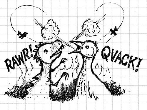
Experts of paleontology rarely debate the existence of prehistoric superwaterfowl, whom I believe waddled the earth during the late Jurassic epoch and the early stages of avian lifeforms. These illustrations – on grid paper no less, thus chockablock with scientific merit – depict a savage territorial battle between Aythya valisineria amplus and an unidentified carnivorous theropod.
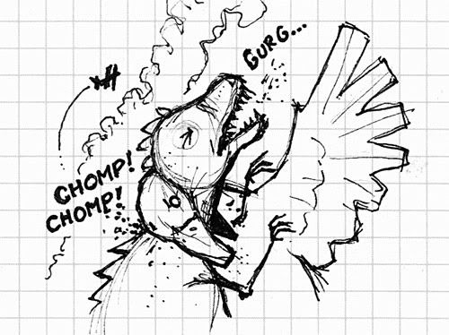
The small, silhouetted airplane-like shapes are indeed 1920s bi-planes; they have been included in these illustrations only for effect, in that they make the scenes more epic.
April 30, 2011
A True North Font, Glorious And (Nearly) Free

I will be the first to admit, I don't dabble in the procuring of typefaces perhaps nearly as much as I should. But when I heard about the promotions surrounding the offering of Gibson, a swish sans-serif set, for dirt-stinking-cheap – and moreso, the reason why – I plonked down for this great cause. And I encourage you to do so as well.
More, on Gibson:
The Gibson font family is a humanist sans serif typeface designed by eminent Canadian type designer Rod McDonald, and produced by Patrick Griffin and Kevin King of Canada Type, to honour John Gibson, one of the original founders of the Society of Graphic Designers of Canada (GDC).
As well as paying tribute to Mr. Gibson’s productive life and love of the typographic arts, the Gibson family is intended to be a mainstay of the future of Canadian design education. Many Canadian design schools and institutions will be making it part of their larger type piracy education programs. The eight-font family is available at token pricing to make it especially affordable for design students. For less than the price of a design textbook, a student can now have a sturdy and contemporary humanist sans serif family that fits pretty much any design application, and will remain useful long after academic studies and well into a professional career in design.
All revenues from its sale will be donated by Canada Type to the GDC, where they will be allocated to a variety of programs aiming to improve the creative arts and elevate design education in Canada. Each of the eight Gibson fonts comes with 370 characters and feature extended Latin-based language support. The Gibson family ships in cross-platform OpenType format.
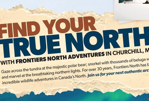
The face(s) have come in handy for myself with a quickness; I've already used Gibson to craft labels for maple syrup bottles through work, and for a freelance jobbie, an ad for a company organizing high Arctic tours. And cripes I say, what is more Canadian than that? And that? I urge anyone reading this with a designerly bone in their body, to get on that action. It's a great cause and for 48 loonies, a price that can't be beat.
April 16, 2011
Man, Answer The Phone
Wrong number messages: my favourite kind of messages.
Turtle and mushroom by Kerry.
April 10, 2011
Owl-less Survey
"It's good... just gotta take it slower."
Famous last words, before proceeding a few more metres in the CR-V and getting stuck. Only nine of the 40-kilometre stretch of foggy logging road had melted to a point of navigability. Cue rigourous rocking/pushing sessions, a couple hundred metres in reverse to the nearest turnaround point, and then high-tailing it back to asphalt. The 2011 nocturnal owl survey was over before it began.
April 05, 2011
243: Preaching To The Converted
A couple of weekends ago, I opened up my vault of photo-a-day photos to see which ones might best benefit from tinkerings with various black-and-white conversion techniques in Photoshop. During the thick of the project, I had often wished to convert some right then and there, but was adamant in sticking to colour and minimal dickings-around with post-processing. These are my favourite six results from this bout of playtime. You can click on any of the images, to view them larger.

Using Photoshop calculations I played God, and turned a red fox white. I was able to separate the subject from the background, a feat I was hard up to perform on this overcast evening with fading light.

Through greyscale conversion I was able to chase the nasty streetlight hues of this original scene and focus on the sheer dump of snow we received one evening last November. This was before the bleakness of the season really set in, and snow like this was more of an exciting thing.

I appreciate how a good conversion can bring out otherwise muted textures. All beiges and light beiges, this savannah sparrow during a songbird banding session at work, remained still enough for me to focus him right in the eye.

Here's me. So emo, during the golden hour and dog days of last summer. I had a lot on my mind and stuff, you know. Just needed a good sit-and-stare, sort some issues out. You know. Stuff.

Here's another shot of me, by guest photographer Anton Corbijn. Anton and myself had just been dying to do a project together…

But, enough about me. Here is my favourite converted photo from my shufflings through the 365 stacks – and it's not just because of the subject matter. I enjoy everything about this image: the reflective hair strands, the uniquely-sized pupils, and especially the silhouetted outline of the right side of Kerry's head. I think I'm in love.
Using Photoshop calculations I played God, and turned a red fox white. I was able to separate the subject from the background, a feat I was hard up to perform on this overcast evening with fading light.
Through greyscale conversion I was able to chase the nasty streetlight hues of this original scene and focus on the sheer dump of snow we received one evening last November. This was before the bleakness of the season really set in, and snow like this was more of an exciting thing.
I appreciate how a good conversion can bring out otherwise muted textures. All beiges and light beiges, this savannah sparrow during a songbird banding session at work, remained still enough for me to focus him right in the eye.
Here's me. So emo, during the golden hour and dog days of last summer. I had a lot on my mind and stuff, you know. Just needed a good sit-and-stare, sort some issues out. You know. Stuff.
Here's another shot of me, by guest photographer Anton Corbijn. Anton and myself had just been dying to do a project together…
But, enough about me. Here is my favourite converted photo from my shufflings through the 365 stacks – and it's not just because of the subject matter. I enjoy everything about this image: the reflective hair strands, the uniquely-sized pupils, and especially the silhouetted outline of the right side of Kerry's head. I think I'm in love.
Subscribe to:
Posts (Atom)