
1) The Meeting Doodle – meetings can last an eternity. During one in January, for some reason I was picturing a hockey goalie so fat and immobile that he fills every inch of the net he's guarding – to the point that his dimensions are identical to the net, which is basically a square. I doodled a rough first attempt, but quit – since I think I was being watched.
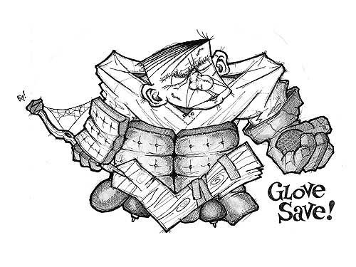
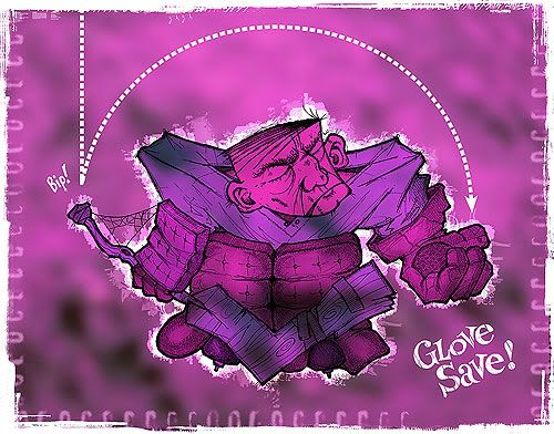
2) The Sketch – later on, I put the idea to paper straight out of my head (above). There's not much I can draw this way – subject matter without reference material of some sort – but hockey players are one of them. I drew him in the style of "yesterday's player" than a modern-day goalie to enhance the fact he benefits more from girth (re: luck) than skill. This meant bulky pads, a few scars, a stick seemingly carved straight from the tree and no helmet. His rough shape and features were done first in pencil, then drawn over and detailed in pen and scanned into the computer.
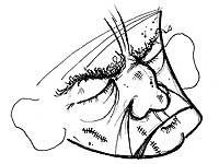

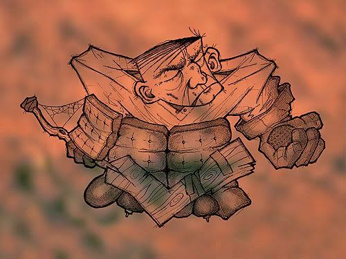
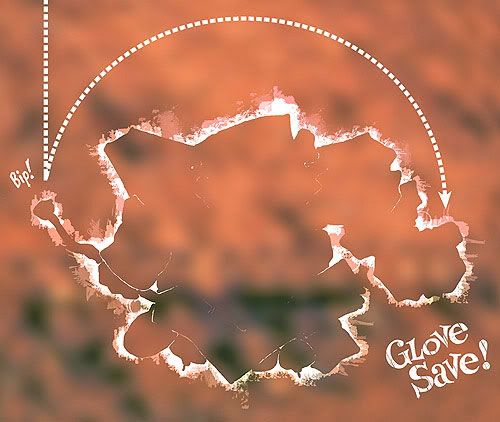
4) Background – I knew the feel I wanted for this illustration from the get-go, in terms of colour and an overall look. In Photoshop, a texture backdrop was added first, made by blurring a photo I took of some rusted metal a few years ago (below). Any colours I used would then be subtle offshoots of this reddish-brown theme.
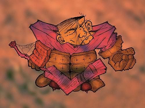
5) Colour – different parts of the goalie were 'painted over' with flat colours ranging from red to blue – to help differentiate the parts of his uniform – and saved as separate layers in overlay mode to blend with the background overtop of the base sketch layer (below).
6) Details – The illustration's words, arrow and other effects were added last. The words, even though part of the initial sketch, were cut early on, inverted to white and pasted in a separate layer for tweaking at the end. The arrow was built in Illustrator and added as its own layer. The white glow around the goalie was added late when I found the image as a whole was skewing too dark and muddy (below).
Once the image was finished, I added the scratchy frame effect – then changed my mind about the colour scheme and skewed the entire thing from rusty red to purple using hue shifts in Photoshop (below).
7 comments:
Very nicely done Jeope! Sweet.
PS: Shoot me an email I want to ask you a question regarding a possible collaboration. (Sp?)
Awesome Jeope! Thanks for posting that because, honestly, I see that I've used some of the same techniques, so I feel like I'm doing it like a real pro If I'm doing it like you :) (awwwwww)
Geez, didja hafta make it sound so easy? You forgot to explain one thing though. Um, how do you make it look so good?? :-) If I could sketch like that, I would definitely try out your techniques. Alas, I'm not blessed in that arena. It's really cool to see the image in steps like that though! Thanks for sharing!!
nice shtuff their Jeope!
between your stuff and von's class downloads, i'll get me a further edumacation w/out ever taking a class! :P
Very nice! Thanks for sharing! It's great to see what goes on 'behind the scenes'.
Thanks for sharing your technique! I love to see how other people work in Photoshop. I really like your style!
Now if I could only put cool artwork on my blog!
You da man, Jeope.
Post a Comment