
Skim through this week's list of Illustration Friday submissions for the word wisdom and you're sure to find more than a fair share of owls – which also happen to be one of my most long-standing objects of interest. I've been fascinated by owls since I was eight years old, when I first saw an Inuit ookpik toy at Robinson's department store in Portage-la-Prairie while visiting my grandparents. An unhealthy chunk of my childhood imagination and play revolved around owls, and they were one of the first things I learned how to draw well. When I was 11, my mom had to console me when I saw a fatally injured great horned owl on the roadside in Whiteshell Provincial Park. Visits from snowy owls are one of my comforts working at a building surrounded by desolate, frozen marshland in winter. And the past four years I've volunteered for the annual spring Nocturnal Owl Survey in eastern Manitoba's boreal forest.
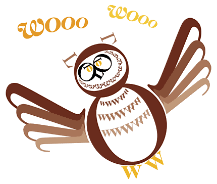
So the word wisdom merely offers an excuse for me to drag out my obsession once more. But rather than attempt a sketch, I combined the subject matter with another interest of mine since college: typography. Working with the bare elements of typographic form was a fun exercise, inspired by graphic designer Roberto de Vicq de Cumptich's clever creation Bembo's Zoo: An Animal ABC Book. I opted for a similar feel, using the equally timeless serif family Caslon to pay homage by creating an owl using only the letters O, W and L. The illustration was built in the soon-to-be-defunct FreeHand.
Click here for a larger view.
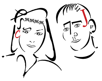
Addendum! Last year our friends Cheryl and Jeff were married (on Halloween, how cool is that?), and for a gift Kerry and I made them a poster (design by me, poem by Kerry). This image was scrapped as part of the final design, but this week's post reminded me that it never saw the light of day – and was my first attempt at trying this sort of thing. Cheryl was drawn using the Adobe multiple-master font Ex Ponto, while Jeff was done up in Bembo. A little stiff, and eventually ditched because it ended up being mostly made of brackets.
19 comments:
Fun with type! You know, I never tire of owls either. Although there have been many owls posted for the wisodm topic, each one has been treated differently. It's really fun to see the various renditions. I like how you've created your guy! He's great!
Hey Jeope, great illo with typographic, and using only the letters o,w,l. I have passed good time in this page www.robotype.net similar to Bembo´s zoo.
Great use of typography and suggestive color. I think this is a great illo.
Owls are indeed intriguing little fellows - but be careful if you have ornamental ones in your house, they're supposed to be bad luck!!!
Oh, goody. I only have about a thousand of them in my house!
You can tell owls were one of the first things you learned to draw. I like your use of typography and he passes on my 'OK cute' scale :)
I love your owl... really clean, sharp.. well done!
Nicely done! Love the typograpic elements.
Very clever. Seems like owls will be very popular this week at IF. ;-)
i think it's great you have such a passion for something...this week was right up your alley, eh?! typography looks like so much fun...have me inspired to play a bit in digital again! mentioning "robinsons" was quite the flash back! they used to be all over northern BC where i grew up
cheers,
kerry
Hey there Jeope!
nice one here with the combination of typography to create a wonderfully striking image of an owl!
very good work, and good you've used something your passionate of...the owl!
;)
Great idea with using type to create the owl, it fits in very nicely too! You sure Freehand's gonna be defunct? Oh no, it's one of the very few programs I'm familiar with...
I love this!
I so love the type. Spectacular!
I love the way you used the lettering!
I can tell you that Jeope was obsessed with owls back in the day, because I've seen it first hand.
Looks great, dude.
I have neglected to put FreeHand on my computer...I miss it.
i have a big creepy owl staring at me from a beam outside my office window.... it scares the pigeons away or something. but mostly it creeps me out. anywho.
i LOVE these jeope! being designers makes our presents so much cooler than regular type store bought stuff. you go boy!
WHOO WHOO!!
Well, he's quite masterfully done - one of the most unique and clever entries this week! I had fun poking around on the zoo site that you referenced..such creativity out there. Thanks for sharing!
I love the owl and the way you made it. Looks good.
wynlen
wynleDesign
Great looking owl, and a fantastic use of type!
Post a Comment