
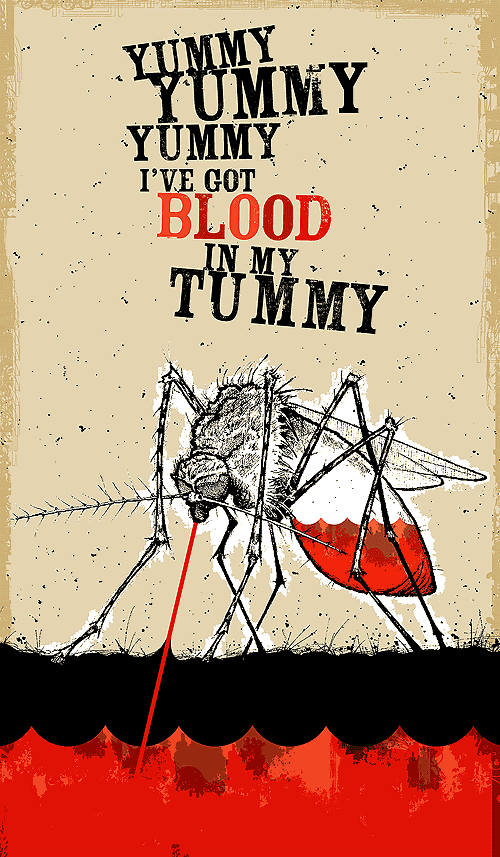
The week's Illustration Friday theme was insect, a fact of life people here in Winnipeg know all too well. And just like the real thing, this digi-mosquito gave me a tough time; the difference between the original concept that buzzed in my head this past weekend and the final result you see here was drastic. But I stuck it out with the beast and came out with this finished jobbie, a merging of a few different styles I've been playing with a lot these days (sketchy pen-and-ink, scattered vector shapes, various overlays).
This mosquito ties in with the very first illustration I posted on this site over a year ago. In my blogging infancy I up-and-decided to draw a horse – something I had never drawn before, to see if I could. And this week I've sketched myself my very first insect, though with the generous aid of a photograph. Even still the photo didn't provide strong detail, and outside of basic shapes and parts I ended up drawing a fair chunk of this fella out of my butt*. Total sketching time was about three hours, some while watching the Academy Awards (Kerry was so happy that Philip Seymour Hoffman won).
Meshing the sketch with my idea for it was a mess at first. The detail of the line-art wasn't gelling with the concept, and after tinkering with a few compromises I eventually settled on this result with a much simpler colour palette and some type inserted as a last-minute addition. I may revisit this bugger and simplify it even further, but for now I wanted to show as much of the original mosquito sketchwork as possible.
* figure of speech
25 comments:
Don't simplify! It hangs together so well the way it is; the sketchy bristly illustration style makes the vector stuff look extra-clean and sharp and the contrast is really stylish.
Bang-up job rendering the skeeter too, the detail of the transparent abdomen is double neat. :)
I think I would have to agree, this picture is about as good as it will get. Tinker any further and you will spoil, what is in my opinion, an excellent picture. I love the contrasting colours, the level of detail. It really is a great picture, don't tinker any further.
I am really impressed with you first attempt at an insect. I would have thought you did this on a regular basis, perhaps working for some museum of natural histroy, illustrating catalogs! Really - the detail is amazing and accurate. It's also a very graphic and creepy picture...I feel my blood draining as I look at its sucking stinger. Well done sir, even if it was drawn from your butt. So to speak:>
Nice work Jeope. I like how she's both "anatomically correct" and looks menacing all at the same time. You get the entomologist's stamp of approval.
Kath
EEEEWWW! How pesky they are! Another fantastic illo by you! Love to see your work!
awesome (as usual :) )
Oh, and I remember the horse too! That doesn't seem like over a year ago. Time flies faster in the 'net universe, I guess.
I'm a Jeope groupie LOL
This is awesome! I think it is perfect!
nice jeope, as always.
I really like the mix of reds and the illustration of course is killer!
i was (always was) going to do an illustration for this week. Dunno if i can, but i may try tonight and tomorrow night.
i still don't know how you produce such consistently nice stuff week to week!
Oh that takes me back the summer I went to Winnipeg. I do believe I went back lighter. But I did enjoy my stay though. He is a hungry one-that bite is going to itch! Very graphic and creepy but I like it.
Weel done.
Thanks everyone!
Lew, the colour scheme was inspired by Geoff's "badly drawn" series he was using as an avatar awhile back.
wow! nice job. i really like it!
Dude, that is SO wonderfully intricate. It makes me itch! You totally slayed this topic.
Wow Jeope! Great work. The detail is amazing and I really like the color palette of the whole piece. I wouldn't change a thing!
To be able to draw like you would be such a gift.
PS: i agree w/Kelly. he wayyyy deserved it!
Wow...a very striking illustration! Nice drawing and bold colors.
I might be 'repeating' what everyone said but I just LOVE the texture. AWESOME! Your butt* produces good work. And the brightness of the blood is so perfect for contrast purposes. I give 10 out of 10 chocolates! (I've decided to grade everything this way from now on!)
*Figure of speech * wink *
Lol...Brilliant!
Very cool. Great job in a twisted sort of way!
i am not a big bug person (ewwww); but this is a really excellent illustration.
Anyone else feeling a bit itchy?? Very nice illo. I like the overall style of this a lot.
i love it. very good design. and funny.
Awesome illio!!
It has a perfect raw edgy style. I especially like the border and the blood in the belly.
What a vampire! great illo -
Great illo, great typography, great design.
Fantastic! Love the colors and the layout. My first time visiting your blog--I'll be back. :)
I so love that illustraion!
Post a Comment