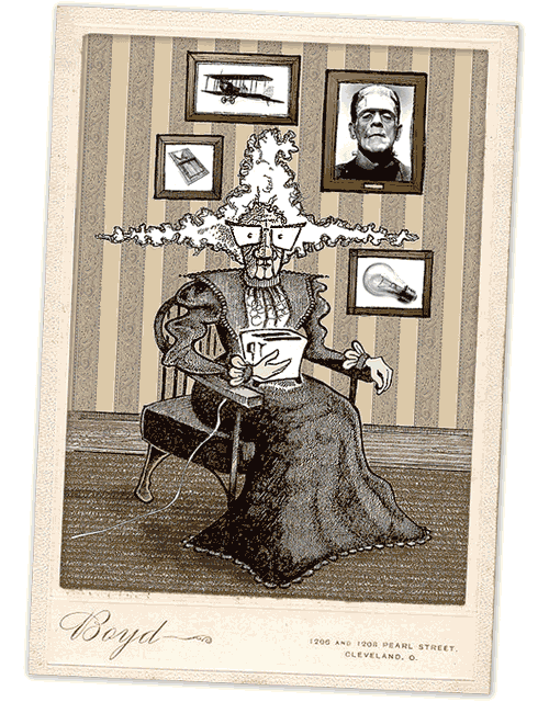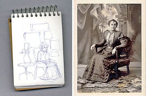
I've never had a concept in mind so quickly for Illustration Friday then I did this week; their current theme of invention brought a vision to my head in a matter of seconds. Stuck at work though, I made a quick doodle of it in a notepad (below left) so I wouldn't forget it on the weekend when I had more time. This old lady is my interpretation of the Mother of Invention (as in "Necessity Is..."). And though my original vision was of a cartoony, Far Side-esque comic strip panel, I ended up with something much more complex. I usually intend to do something simple; I just can't seem to help it.
I found some source material through a few Google image searches: a few turn-of-the-century photo portraits for the pose and fashion sense (below right), and obviously the objects in the wall-mounted frames, which I left photographic because they kind of look neater that way. I sketched on Sunday – all in all about two hours or so – and used photos of various textures to fill in the background, like wallpaper and carpet samples and some wood-grain for the baseboard. Be sure to click here for a better look at the whole deal (the web just doesn't do some illustrations justice).


20 comments:
Great illustration!
Thanks for showing the process. Its nice to see the source. It turned out great!
Haha great idea and illo I like how you've presented it. bravo!
Really terrific work! And thanks for sharing your process. I almost missed the cleverness of what was n your picture frames!
I love it! Great illustration!
wow! this is great...so unique!
Pretty cool! Great!
great looking illo and i agree with everyone else nice to see the process.
AWESOME!! Love the concept and the style!
Very nice concept and presentation. I like how she is holding the toaster and her hair is sticking out... almost like she had done a bit of experimenting with that appliance and had gotten a shock. Come to think of it she does look shocked... just like most moms at one point or another.
I really like the work you have done!!
Great idea! I love the way you made it look like an old photo.
very cool
and kinda scary
Curious illo! loe it! great
saludos
creepishly fantastic! love the frank's monster framed! too wonderful!
I especially love the concept behind this one!
Love it! This might be my favorite so far.
Uh-oh...we might think alike...great compilation..(and I finally got your comment posted on the anime' deal...it didn't take the first time...)
Thanks for commenting, everyone – it was a good theme for getting the creativity going. There's some really cool submissions out there this week.
classic illustration!
BRILLIANT! It cuts soo sharply and vividly.
Post a Comment