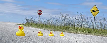
Those interested in photography ought to check out PhotoFortnight, the summer brainchild of fellow HOW forum participants Sean O'Dwyer and Joe Blend. Their site offers photographers of all skill level an opportunity to send in submissions based on the site's bi-weekly theme. Once all submissions have been received, they can be voted on by viewers. Results are then posted roughly one week later. But unlike the massively popular Photo Friday, only pictures snapped within a two-week window are accepted. PhotoFortnight also offers themes that call for a little extra thinkwork, and even a touch of design sense. Case in point, the latest theme: yellow. My concept here is pretty plain-Jane, using a unique road sign just outside of where I work. But the image that was in my head differed sharply from my best final output, so I spent some extra time mulling over a yellow-based still-life session the next day with objects from around my house (see below). In the end though, I submitted the original idea. It's goofy. So after the long weekend, head over to PhotoFortnight and vote. And be kind to my pic!

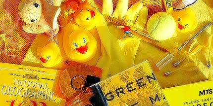
A slightly Photoshop-enhanced outtake from the second shoot. This one shows the grand pile of stuff that I gathered together (sad that I forgot to bring my happy-face frisbee). R.E.M.'s Green is my favourite item in the shot. Also shown is one of only two modern-day issues of National Geographic without a photo on the cover.  And in this one, the soon-to-be-famous duckies are ready for their close-up. For now though, it's back to their spot atop the sill above the toilet tank.
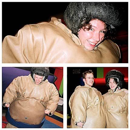
 For an anniversary surprise, Kerry took me to the local kids' party/playzone dealie to sumo-wrestle in giant foam outfits – just like I always wanted to after watching so many lucky people do it between innings at Winnipeg Goldeyes games. It was total geeky fun. And even though there were no photos of our actual match, I have to admit I absolutely dominated the dojo. I was Yokozuna. I "brought it on".
[image missing]
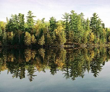
A quickie. This week Illustration Friday offers the theme word reflection, which will undoubtedly score a hit as the word's malleability is pretty inviting. As such, I took the word for a spin on its most basic route, that being the notion that art is a reflection of an artist's reality.I have not yet perused the stack of submissions to the site, but I foresee quite a few of images being reflected and transposed. The image above however, is based directly on a very real photograph I took while huffing along the Hunt Lake Hiking Trail with Kerry in Whiteshell Provincial Park. The trail, a favourite of Kerry and myself, takes seasoned hikers by several beautiful vistas and across the most rugged terrain Manitoba can offer (which isn't saying too much). We head there in the fall every year. We've been practically nose-to-beak with loons, eagles and grouse, seen brilliant displays of yellow-leaved aspens and bright red sumac bushes and once caught a rare glimpse of a river otter.The bottom half of the image was selected and run through a variety of Photoshop filters, curves, brushes and saturation adjustments. Posted below is the original photograph, taken early on a calm Saturday morning in the fall of 2003, during one of our hikes. Also posted (at bottom) is another, solely photographic take on the same idea, using an abstract shot of the Gateway Arch in St. Louis, taken along the way to our spring fling at Mardi Gras. Side note: I may well be the millionth designer to realize, but the word reflection almost reflects itself when rotated 180 degrees. That's the concept behind the word form here. Some kerning, employing a geometric font (Helvetica Neue 85 Black) – substituting the lowercase R with a custom-chopped lowercase N – and slicing the word along the center of the word's x-height was all it took.

August 18 is one of my favourite dates of the year. It marks the day in 1998 when Kerry and I officially became a couple. And I mean officially – I asked her out with a customized resumé, handed to her in my tumbledown bachelor apartment on Evanson Street. Seven years later we have a home together, and on this day I couldn't possibly be a happier person.
Happy seven years, Kerry. I love you very much.
– Jeope

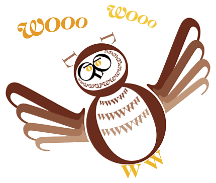
Skim through this week's list of Illustration Friday submissions for the word wisdom and you're sure to find more than a fair share of owls – which also happen to be one of my most long-standing objects of interest. I've been fascinated by owls since I was eight years old, when I first saw an Inuit ookpik toy at Robinson's department store in Portage-la-Prairie while visiting my grandparents. An unhealthy chunk of my childhood imagination and play revolved around owls, and they were one of the first things I learned how to draw well. When I was 11, my mom had to console me when I saw a fatally injured great horned owl on the roadside in Whiteshell Provincial Park. Visits from snowy owls are one of my comforts working at a building surrounded by desolate, frozen marshland in winter. And the past four years I've volunteered for the annual spring Nocturnal Owl Survey in eastern Manitoba's boreal forest.So the word wisdom merely offers an excuse for me to drag out my obsession once more. But rather than attempt a sketch, I combined the subject matter with another interest of mine since college: typography. Working with the bare elements of typographic form was a fun exercise, inspired by graphic designer Roberto de Vicq de Cumptich's clever creation Bembo's Zoo: An Animal ABC Book. I opted for a similar feel, using the equally timeless serif family Caslon to pay homage by creating an owl using only the letters O, W and L. The illustration was built in the soon-to-be-defunct FreeHand.Click here for a larger view.

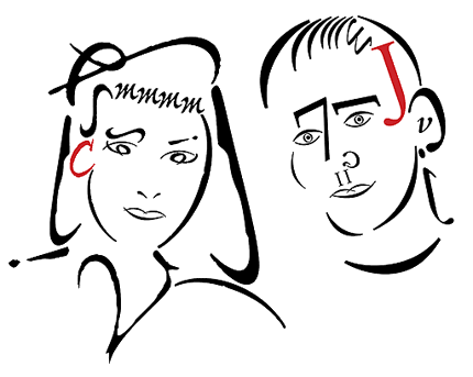
Addendum! Last year our friends Cheryl and Jeff were married (on Halloween, how cool is that?), and for a gift Kerry and I made them a poster (design by me, poem by Kerry). This image was scrapped as part of the final design, but this week's post reminded me that it never saw the light of day – and was my first attempt at trying this sort of thing. Cheryl was drawn using the Adobe multiple-master font Ex Ponto, while Jeff was done up in Bembo. A little stiff, and eventually ditched because it ended up being mostly made of brackets.

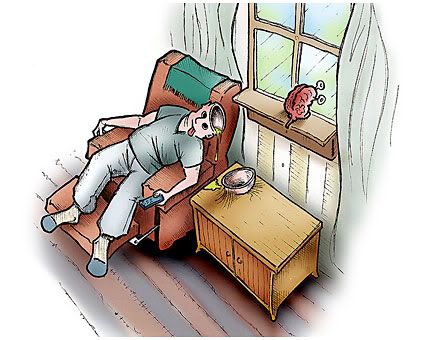
The word empty is a far-reaching term, elastic enough to cover just about any illustration concept on the planet. Which is healthy. Case in point, my drawing here. This was a discarded sketch from about a month ago when the posted Illustration Friday theme was nourishment. I was basing this piece on a premise of "nourishment for the brain", but then grew weary of it and drew a sandwich instead (click on the "Draw!" button and select nourishment to see).But it also represents this week's theme in its concept of empty-headedness. Thus, behold the couch potato, so buried in his inertness that his brain has split in search of alternative entertainment out the window. I picked up the half-finished pencil rendering from a month ago and completed it in pen. It was then scanned and opened into Photoshop for colouring. The angle and style of the sketch were inspired by comic strip artist Wiley Miller, the genius behind the daily one-panel series Non Sequitur – and a man who adores his perspective drawing.
Be sure to click here for a larger view of the illustration.
Summer equals festivals in Winnipeg. The second weekend in July always brings with it the Winnipeg Folk Festival, which I have been attending since 1993 in one form or another. This year's event coincided with the move into our new house, but priorities being what they are, we still managed a healthy dose of entertainment at the festival. This year marked the debut of new music programmer Chris Frayer, and he came through – in my opinion – with a much-improved lineup over 2004. Highlights for me ranged from the return of California-based blues wonderkid Jackie Greene, back-to-back afternoon concerts from Feist and Buddy Miller (with surprise guest and Sunday night headliner Emmylou Harris), an awesome Friday night show by the New Orleans group Bo Dollis & The Wild Magnolias and a tight Saturday night gospel set by The Campbell Brothers. The best performance of the four-day event came from the one-man-does-everything Aussie didgeridoo-guitar-DJ sensation Xavier Rudd, who delivered the most energetic show I've ever seen at the festival. A hit from last year's alternative evening stage, Rudd arrived this year with huge buzz – and brought along fellow countrymen The Beautiful Girls, who came through with a peppy surf/ska-tinged set on Saturday evening. A ton of fun, energy-sapping heat – and mud, as evident in the photo four posts ago.A week later marked the beginning of the 11-day Winnipeg Fringe Festival, which has become one of the largest alternative theater events in the world. Kerry and I squeezed in eight shows this year – a new record – ranging from good to incredible. This year we took the review-snob route and stuck to performances that garnered top marks (no shots in the dark for us!). We saw a couple of tried-and-true returnees: the latest creations from funnyman Chris Gibbs (Antoine Feval) and monologuist extraordinaire TJ Dawe (A Canadian Bartender At Butlin's), along with festival faves pornStar, The Comment Card, The Cloud Factory and The Pajama Men In 'Stop Not Going'. Also on our hit list were Under The Door and Felix Listens To The World, which Kerry has officially dubbed "the best show she’s ever seen" at the festival. I think I might have to agree. It's brilliant.Our Fringe experience was truncated because of another Winnipeg tradition: the Great American Shopping Trip. This past weekend was of the long variety for Canucks, and we hooked up with newly-wed newlywed friends Christian and Amara for a quick excursion to Minneapolis – a fine town we'd like to visit again. Top props imaginable to Christian for taking care of the big-city freeway driving! Plus, I got to touch a stingray!

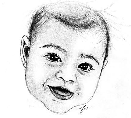
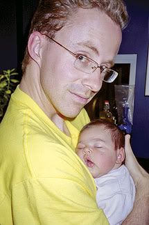
I really wanted to get back to my weekly creations, but so much has been going on over the past month or so – festivals, moving, unpacking, weekend trips – that it's been tough. And to get back in the swing of things was harder than I thought it would be. Case in point, this week's Illustration Friday theme: the word aging. I've been chewing on it all week. Originally I wanted to draw pen-and-ink caricatures of the morning mall-walkers at my carpool pickup spot. I was gonna draw them during a recent long car trip to Minneapolis, but the ambition was never there, and when I finally sat down to try it I realized my memory of these folks was hazier than I thought. I then considered sketching a scene from our new "aging" house. Two tries; it wasn't happening. Finally, I noticed the photo of my niece on the fridge. She's totally aging.My niece – Cadence Wolfe Daya – lives in rural Nova Scotia with my dentist sister and her dentist partner. She was born last September. Kerry and I went to visit just before Halloween when she was about six weeks old. Cadence and I had a couple of beautiful photo shoots (see below). Since then, I've watched and listened to her grow through photos in the mail and phone calls. Most recently I received a shot of her sitting in the grass with a ball cap. She looks so different from the baby I met in the fall. And the next time I'll likely see them is next summer, when she'll be a walking, talking wonder-kid. Canada's an enormous place, and it's during times like this when the distance can hurt.This sketch was done over the last couple of days during moments of free time. It's small, honest and simple. I took a quick spin through Photoshop to clean up a few errors.
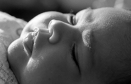
Right: Kerry's shot of me and Cadence, October 26, 2004. Below: snapshot of Cadence from my black-and-white photo shoot, October 28, 2004.
