
The company – currently being crafted by recent PrairieView School of Photography grad Sarah Hodges-Kolisnyk – is Hodgepodge Creative (site under work, but be sure to check the blog), a one-woman wrecking crew of skills ranging from professional photography to creative and journalistic writing to audio/video production.
The trick then for her logo-designer-in-arms, as per her wishes, was to express this wide-ranging skills set within a single, strong – and simple – all-encompassing visual. And following an initial coffee-house meetup to discuss and peruse her then brand-new portfolio, I sent her on an expedition to gather together visuals that shared common traits with what she had in mind for her own business (not a standard procedure, but between friends one can do this).
Sarah came through in spades; she is a great client (Sarah, if you're reading this, you are a great client). She had a strong built-in sense of what she wanted in terms of look/feel, colour schemes and general aesthetics. And I'm a huge fan of not having to mind-read. Who is?
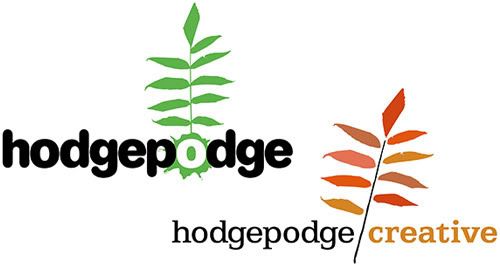
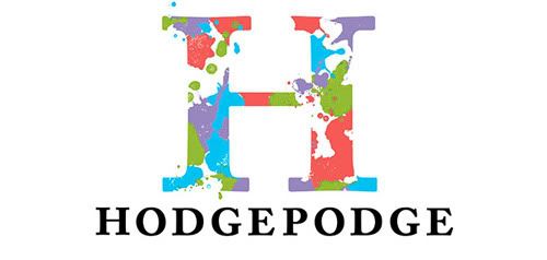
From her Big List of Inspiring Visuals, I was able to confidently go about building a few options, then submit them for further discussion and refinement. Two concepts (above) played largely on her zeal for the outdoors and knack for nature photography, and utilized compatible tones as such. A third (below) took on a more abstract/typographic form. All were received well and good, and constructive feedback was lent.
“The word ‘hodgepodge’ makes me think of a pig,” Kerry said to me around this point (I’m paraphrasing). “You should do one with a pig.”
And that night, I dreamed of a logo concept – with a pig. The next day, I set to work.
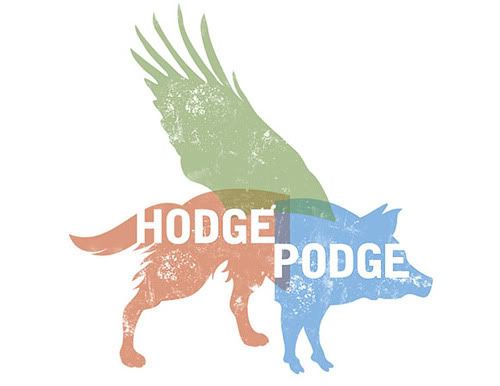
After time, the concept – that of a creative beast of many talents – eventually came to fruition (above). Much tweaking and haranguing was involved, particularly in how the three equal elements would join and/or overlap. It was important that no one element overshadow the other two, and yet a single, blended shape was not achieving the desired outcome. I finally came about with offshoots of red, green and blue – representative of the colour model used in displaying images electronically.
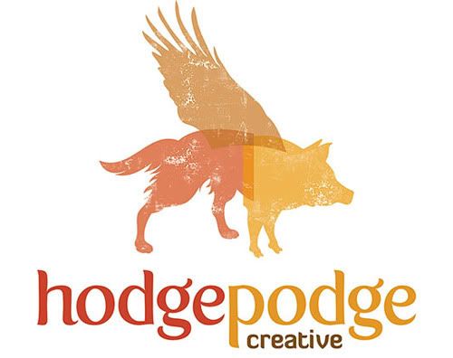
I felt it imperative Sarah remain integral in the development of the final result (below). Throughout the process I included her input on style, colour and typographic decision-making, which eventually resulted in a last handful of tweaks; dropping the bold – yet perhaps overly-industrial – typeface for an earthier, friendlier one, and an automnal colour palette more in tune with her company's character and focus of her work.
5 comments:
Fabulous! I really do love them all. Lucky for you Kerry is there to art direct. :)
I love these! What typeface are you using in the last one? I like that...
Mary, the typefaces are from the Exljbris Font Foundry:
http://www.josbuivenga.demon.nl/
The main face is a slightly-tweaked Fertigo, and the "creative" face is Diavlo.
good god, man! that is brilliant! While the first ideas were good, I was smacked across the face with the final. Love. And, you rock. But I say that all the time.
NICE. super nice.
Post a Comment