
April 16, 2011
Man, Answer The Phone
Wrong number messages: my favourite kind of messages.
Turtle and mushroom by Kerry.

April 10, 2011
Owl-less Survey
"It's good... just gotta take it slower."
Famous last words, before proceeding a few more metres in the CR-V and getting stuck. Only nine of the 40-kilometre stretch of foggy logging road had melted to a point of navigability. Cue rigourous rocking/pushing sessions, a couple hundred metres in reverse to the nearest turnaround point, and then high-tailing it back to asphalt. The 2011 nocturnal owl survey was over before it began.
April 05, 2011
243: Preaching To The Converted
A couple of weekends ago, I opened up my vault of photo-a-day photos to see which ones might best benefit from tinkerings with various black-and-white conversion techniques in Photoshop. During the thick of the project, I had often wished to convert some right then and there, but was adamant in sticking to colour and minimal dickings-around with post-processing. These are my favourite six results from this bout of playtime. You can click on any of the images, to view them larger.

Using Photoshop calculations I played God, and turned a red fox white. I was able to separate the subject from the background, a feat I was hard up to perform on this overcast evening with fading light.

Through greyscale conversion I was able to chase the nasty streetlight hues of this original scene and focus on the sheer dump of snow we received one evening last November. This was before the bleakness of the season really set in, and snow like this was more of an exciting thing.

I appreciate how a good conversion can bring out otherwise muted textures. All beiges and light beiges, this savannah sparrow during a songbird banding session at work, remained still enough for me to focus him right in the eye.

Here's me. So emo, during the golden hour and dog days of last summer. I had a lot on my mind and stuff, you know. Just needed a good sit-and-stare, sort some issues out. You know. Stuff.

Here's another shot of me, by guest photographer Anton Corbijn. Anton and myself had just been dying to do a project together…

But, enough about me. Here is my favourite converted photo from my shufflings through the 365 stacks – and it's not just because of the subject matter. I enjoy everything about this image: the reflective hair strands, the uniquely-sized pupils, and especially the silhouetted outline of the right side of Kerry's head. I think I'm in love.
Using Photoshop calculations I played God, and turned a red fox white. I was able to separate the subject from the background, a feat I was hard up to perform on this overcast evening with fading light.
Through greyscale conversion I was able to chase the nasty streetlight hues of this original scene and focus on the sheer dump of snow we received one evening last November. This was before the bleakness of the season really set in, and snow like this was more of an exciting thing.
I appreciate how a good conversion can bring out otherwise muted textures. All beiges and light beiges, this savannah sparrow during a songbird banding session at work, remained still enough for me to focus him right in the eye.
Here's me. So emo, during the golden hour and dog days of last summer. I had a lot on my mind and stuff, you know. Just needed a good sit-and-stare, sort some issues out. You know. Stuff.
Here's another shot of me, by guest photographer Anton Corbijn. Anton and myself had just been dying to do a project together…
But, enough about me. Here is my favourite converted photo from my shufflings through the 365 stacks – and it's not just because of the subject matter. I enjoy everything about this image: the reflective hair strands, the uniquely-sized pupils, and especially the silhouetted outline of the right side of Kerry's head. I think I'm in love.
March 28, 2011
242: Proudest Moment

One of the pitfalls of having left this blog sit and stew for so long is that I never got the timely and proper opportunity here to crow about quite possibly my proudest achievement in design in a long, long while – the jacket I concocted for Vs., Kerry's second published book of poetry. The book, whose creation and production zipped along at a rapid clip over the course of 2010, was launched with great fanfare (and a three-city cross-country tour) earlier this winter.
We both had much fun collaborating on her first book, The Sleeping Life, in 2008. Admittedly, it can be dangerous territory when married creatives try and combine forces. But for those who hold steadfast to the belief that the customer/client is always right (a belief, I believe, in many cases is absolute hooey) our two jaunts book-jacket-land serve as a shining example. Kerry the Client art-directed her covers to perfection, knowing precisely what she wanted to best wrap her words in. And myself, as the Hands, served humbly and admirably.

For her second book, the base concept was once again hers (she also located the source photo, from the Library of Congress). I provided more this time around, stylistically, building a faux-tattered piece to portray a battered and time-worn feel. Carefully blending together freebie textural elements located across the Great Wide Internet, and capping with a dominant and weathered Helvetica super-duper-ultra-black for the title, I think it's a proud-looking thing.
I'm tooting my horn here, and I don't usually like to do this with such enthusiasm. But I was a happy, happy cat the day the first samples arrived, printed up in all their 5x7 glory – my all-time favourite dimensions – in a fine and fibrous stock.
And I still am. We still are.
March 21, 2011
Modern Man

Exhibit A: the Monday morning meeting doodle.
I read books, and magazines. I unfold, scan, and re-fold highway maps. I look in the phone book. I call Tele-Bus. I record 30 Rock with a VCR. I take photos with a camera. I go outside to play. I sketch first with a pencil, then use a pen. I spend most of my days in InDesign. I've never owned a cell phone. Or smart phone. Or whatever they're called. But so far as I know, I think I nailed the essence of them here, in all of 30 seconds it took me to ink this sucker out...
Without using a pencil first. Oops.
March 20, 2011
Got Six Minutes And Forty Seconds To Spare?
Then check out this slice of goings-on at GDC Manitoba's most recent PechaKucha Night at the Park Theatre, featuring myself and 365-photo cohort Karen as we dissect our year of photo-journaling in lightning-fast fashion. I was nervous as a mutha, and had no idea my voice was so high. In hindsight, I would do it again in a snap. It's an absolute rush.
The next event goes down in June. If you have any sort of creative bent whatsoever, and have a story to tell, I strongly advise you to try this event out, as a speaker or spectator.

Meanwhile, Kerry is hands-down, the most creative person in this household. A single Saturday class in needle-felting has resulted in a gush of fuzzy creations popping up around the place like... like...

...well, like something. I just can't think of exactly what.

As such, I decided to take my own creative leanings outside. Facing a rare above-zero Sunday in mid-February, I sculpted this hale fellow in the front yard. But one month later he began to show the onset of spring in these parts, slowly wasting away to an avant-garde piece of modern art that I couldn't create if I tried. But sad news to report: his head was officially offed yesterday afternoon while we were out muchly enjoying Baraka Pita and a matinée screening of The Illusionist (my stars, a beautiful-looking thing).
March 10, 2011
A Little Pecha, A Little Kucha

In and amongst flashbacks here to goings-on of the past eight months, there's still plenty enough going on in the present. To wit, last night, when I bit the bullet and hit the stage for PechaKucha Night.
(I should refine that – I bit half the bullet, since my stage-time was shared with friend Karen as we divulged on our respective photo-a-day ordeals.)
But yeah, OK. I said a funny-sounding word without a whole lotta explanation: PechaKucha (pronounced, I believe, puh-CHOCK-chaw) is a movement borne in Tokyo some years ago as a collaborative event for creative types to convene, talk – the word means "chit chat" in Japanese – and share what they're doing, and what's on their mind. Operating under the founding umbrella organization, these events are put on around the globe. Including Winnipeg, where they're organized by the good folks at the Society of Graphic Designers of Canada's (GDC) Manitoba chapter – for which I am in my fourth year of handling communications duties.
GDC Manitoba has now successfully staged five of these events, each featuring roughly a dozen speakers from all manner of creative disciplines (Kerry did one, in August). During an event, each presenter is given six minutes and 40 seconds to talk, while 20 slides run, 20 seconds a pop. This rigid formula can either drive presenters to panic and fluster, or to a fluid, tight schpiel. Either way, the thing moves. And entertains, massively. And that's what matters.
Watching over four previous editions as volunteer, co-organizer – even emcee – I've been eager to edge my way into a line-up, but never had an idea for a presentation. That was solved when Karen and myself joined forces to use PechaKucha V as a form of closure to our photography projects. Bittersweet, sure, but our time on stage in the spotlight was a real kick, lightning-fast as it was. I'd certainly do it again in a flash given the chance.
A compact collection of snaps from the event can be seen here. The next PechaKucha will be in June. I'd heartily recommend it as a thing to do, or see. It's a great display of talent.
March 06, 2011
241: Winning The Typophile Vote
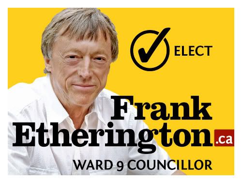
This past fall I applied my design skills to a fantastic cocktail of social betterment and blatant nepotism by crafting the visuals for my dad's first crack at public office, a position on city council in my long-long-ago hometown of Kitchener, Ontario.
We risked the handlebar-moustache-by-Sharpie treatment by the graffiti set and rolled out an array of materials featuring his familiar mug, which, previous to his political career, ran in the city paper week in and week out during his many years as reporter, editor and columnist. Thus, the image was a brand not to be trifled with.
To avoid affiliation with major political parties, many colours were nixed from the get-go. In the end, a combination of yellow and dried-nosebleed red – one of my all-time favourites – was incorporated into brochures, leaflets, leave-behinds and lawn signs (above, and below).
Typographically then, which way to go. Hobo? Too hippie-dippy, wavy-gravy. Impact? Too lock-down conservative. Helvetica? Too Swiss. Comic Sans? Too self-destructive.
Clarendon. It works for Jeopopolis – check the banner, see for yourself. The slab-serif face handles dual roles delicately: its serifs keep things personable, while still conveying the strength and doggedness of a long and well-respected journalistic career. Toss in Fontin Sans, crafted wonderfully by Jos Buivenga's exljbris foundry, to support the cause and I safely feel like I've performed my civic and typographic duty.
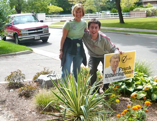
I'm pleased to announce, the materials were a huge success. Or, in more accurate terms, success enough that he won the council seat by a single vote, 1689 to 1688 – a margin that ultimately stood up despite disputes, recounts and ensuing court battles. It's lesson enough, that the ages-old credo that every vote counts should remain valid.
Good design wins, by a nose-hair.
March 04, 2011
240: Down, But Not Out
Welcome to the redesigned, re-purposed – and re-dedicated – Jeopopolis!
(I feel myself saying this as much to you, as I am to myself.)
So, how's tricks? I must say I found that without a blog to kick about, I started to get a lot of shit done. Ventures that took time and some patience, a virtue I was not expressing well in the assembly-line of posts being rung up here week in and out. I started to like not having to think about it; frighteningly, a little too much on some days. Other days, I forgot the site even existed. Sometimes people would ask me about it, but I didn't have answers. I figured the time would either come, or it wouldn't.
The blog, it was becoming an albatross around my neck – a neck neck-deep in a time-sucking, energy-tapping photographic opus and a desire to let this site sit as long as it took to become compelling for me again. Which, I'm happy to report, it now has.
And I've got an awful lot of catching up to do, a lot of work and fun to document. There's been a welcome infusion of freelance work. The launch of Kerry's second book, a major moment in her literary career that I shared, in my own tiny way, by living out my own professional fantasies as book jacket designer. And there was the matter of that photo-a-day project; it's no mystery by now I completed it, officially kicked its ass, displayed it to the world with my friend Karen in a gallery exhibition that closed up shop last weekend.
So for starters, I present a trio of spot illustrations I crafted late in the summer for placement on interior pages of Kerry's new book – titled Vs. – to help indicate chapter breaks. Using old-timey reference photos, I built five illustrations all told, to accompany five short poems detailing the sensations of five different boxing punches.

The illustrations ultimately didn't make it into the final layout. It was a downer at first; I was proud of knocking out pieces of work dabbling in material and a style I was quite unfamiliar with. The sketches gave me a good opportunity to attempt some fluidity in my stiff drawing manner (you can click on any of the three images, to view them larger).

I came to the same realization Kerry's editor/publisher did – that the drawings didn't gel with some of the book's central themes. They would have been window dressing at best, and distracting at worst. It was the right call. And mebbe someday in the future they can be rolled out for another use. You never know with these things.

(I feel myself saying this as much to you, as I am to myself.)
So, how's tricks? I must say I found that without a blog to kick about, I started to get a lot of shit done. Ventures that took time and some patience, a virtue I was not expressing well in the assembly-line of posts being rung up here week in and out. I started to like not having to think about it; frighteningly, a little too much on some days. Other days, I forgot the site even existed. Sometimes people would ask me about it, but I didn't have answers. I figured the time would either come, or it wouldn't.
The blog, it was becoming an albatross around my neck – a neck neck-deep in a time-sucking, energy-tapping photographic opus and a desire to let this site sit as long as it took to become compelling for me again. Which, I'm happy to report, it now has.
And I've got an awful lot of catching up to do, a lot of work and fun to document. There's been a welcome infusion of freelance work. The launch of Kerry's second book, a major moment in her literary career that I shared, in my own tiny way, by living out my own professional fantasies as book jacket designer. And there was the matter of that photo-a-day project; it's no mystery by now I completed it, officially kicked its ass, displayed it to the world with my friend Karen in a gallery exhibition that closed up shop last weekend.
So for starters, I present a trio of spot illustrations I crafted late in the summer for placement on interior pages of Kerry's new book – titled Vs. – to help indicate chapter breaks. Using old-timey reference photos, I built five illustrations all told, to accompany five short poems detailing the sensations of five different boxing punches.
The illustrations ultimately didn't make it into the final layout. It was a downer at first; I was proud of knocking out pieces of work dabbling in material and a style I was quite unfamiliar with. The sketches gave me a good opportunity to attempt some fluidity in my stiff drawing manner (you can click on any of the three images, to view them larger).
I came to the same realization Kerry's editor/publisher did – that the drawings didn't gel with some of the book's central themes. They would have been window dressing at best, and distracting at worst. It was the right call. And mebbe someday in the future they can be rolled out for another use. You never know with these things.
August 03, 2010
239: Six-Month Check-In... And Out
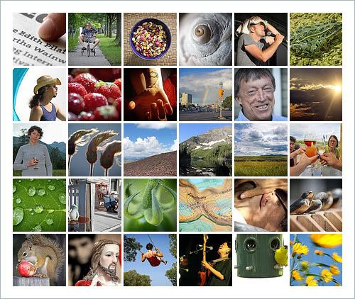
Something is inherently wrong here; I've really let this place go to pot, and I'm feeling bad for it. Typically, in summers past, this is the time of year where I consider a shutdown – usually for good-weather reasons, getting away from the monitor, etc. But this time is different. For the first time in this site's long run I've neglected it to a worrisome point.
So consider this an official check-out notice. I'm essentially saying what has been painfully obvious: I haven't been around here – and I don't plan to, until I decide exactly what it is I need to do next with this site. I've been putting so much effort into my Flickr photo challenge that this place seems like an ugly stepsister.
It's not to say I don't have creative irons in the fire. I do. A few, anyways. And someday down the line they may be worth showing. But the bigger picture dictates I close up shop until further notice. It may result in a retooling. Or a total comeback. Or something else, but it's clear from the overwhelming silence here that it's necessary.
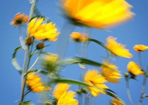
My July batch of photos are above, and my pick of the litter below. It's been a great month for shooting, and just when I think I'm tapped out even taking photos something wonderful presents itself. That's exactly what happened today, with this shot of Maximilian sunflowers at work – and I'm grateful we crossed paths, and the wind blew the way it did, and the sky was as blue as it was.
As always, check the photos daily. Right here.
Subscribe to:
Posts (Atom)