
A quickie. This week Illustration Friday offers the theme word reflection, which will undoubtedly score a hit as the word's malleability is pretty inviting. As such, I took the word for a spin on its most basic route, that being the notion that art is a reflection of an artist's reality.
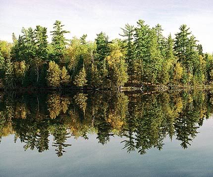
I have not yet perused the stack of submissions to the site, but I foresee quite a few of images being reflected and transposed. The image above however, is based directly on a very real photograph I took while huffing along the Hunt Lake Hiking Trail with Kerry in Whiteshell Provincial Park. The trail, a favourite of Kerry and myself, takes seasoned hikers by several beautiful vistas and across the most rugged terrain Manitoba can offer (which isn't saying too much). We head there in the fall every year. We've been practically nose-to-beak with loons, eagles and grouse, seen brilliant displays of yellow-leaved aspens and bright red sumac bushes and once caught a rare glimpse of a river otter.
The bottom half of the image was selected and run through a variety of Photoshop filters, curves, brushes and saturation adjustments. Posted below is the original photograph, taken early on a calm Saturday morning in the fall of 2003, during one of our hikes. Also posted (at bottom) is another, solely photographic take on the same idea, using an abstract shot of the Gateway Arch in St. Louis, taken along the way to our spring fling at Mardi Gras.
Side note: I may well be the millionth designer to realize, but the word reflection almost reflects itself when rotated 180 degrees. That's the concept behind the word form here. Some kerning, employing a geometric font (Helvetica Neue 85 Black) – substituting the lowercase R with a custom-chopped lowercase N – and slicing the word along the center of the word's x-height was all it took.

18 comments:
Jeope, nice one again!
as a graphic design student i must say great typographic work here, especially with the composition and layout of type and image!
;)
Really excellent typograpy work - it's perfect! I enjoyed looking at it again and again to see how you made it work. Thanks for sharing the process too!
wow, that's really cool.
Very clever and well done! Whiteshell Provincial Park looks like a fine place for reflection. Your typographic submission is brilliant!
Great typograpic work !
Like all others have said, you rendered your typo extremely well. I like your earlier work for Wisdom too.
Superb typography !
Great job...thanks for walking us through your process. The finished illustration is so crisp and coloful. I really like it!
Way cool! You are so good with manipulating type, superb.
jeope,
once again - very nice!
great concept.
Very cool art. I really enjoyed reading your blog too.
Nicely done Jeope! I appreciate the time and effort you put into this, interesting that you'd chosen a photographic entry from an outing with your girl, so was mine! Love the typographic effort as well, very impressive.
wicked! you've got so much going on here, all in harmony...very cool!
cheers,
kerry
oOoooOooo.. I love your play with the word. SO inventive. Love the water reflection too. ;o) thanks for the great comment.
Cool- I like how you made autumn colors from coniferous trees!
It's funny, but when I saw this I thought "Spring and Autumn," with the two reflecting each other, and equally legitimate given that the writing is the right way around in both. However, it was strange to find that the picture I took for "Spring" was in fact taken in Autumn :). This has a great organic feel and the tweaking hasn't lost anything, while gaining strong colours.
Thanks for your comments on my Blog about local bird behaviour - most interesting!
Lookin' good, mister. That'd make a wicked book cover.
I really admire you talent for typography!
Post a Comment