Showing posts with label Photoshop. Show all posts

February 10, 2015

Winnipeg Candy Hearts

Winnipeg candy hearts
A little break from writing… kinda sorta. With Valentine's Day approaching, love – and Loveday, when the wind is right – is in the Winnipeg air. It's a time when lovers of all stripes in my hometown make way for romance – be it skating on the river, sipping together on ruby-red cream soda Slurpees, or cheapskating with some February 13th and 15th dinner reservations.

Click on the image to view the whole thing slightly larger. This exercise in Photoshoppery was partially inspired by my friend Carl Shura's fantastic downtown Winnipeg-themed Valentine's Day cards. 

March 08, 2013

278: Belly, Up

A Photoshop experiment resulting from a series of belly-shots taken of Kerry during her pregnancy, beginning at week 16 in September and continuing through to the bitter/sweet end. Photographed entirely in our living room using natural light (sometimes scarce in the dead of winter), with the exception of week 32, which was taken in Fernie. Shots from week 33 were accidentally deleted.

Use the scroll-bar at the base of the image to view the whole series.

December 17, 2012

274: The Icicle Thief

the icicle thief
We spent time this summer building a slideshow in honour of Kerry's parents' anniversary (me: scanning and designing; she, sneaking and supplying from their archives). We came across a photograph from the early 1980s of Kerry in her snowsuit, sucking an icicle outside of the family cottage. While it struck me as merely adorable, I realized when the first snow fell this winter that the photo would serve as perfect reference material for this year's Christmas card.

The image itself (below) is very pleasing. The clothing and film grain suggest a different era, but one not so long ago. In these wintry parts warmth still overpowers style for small kids – parents will, ideally, see to that until the end of time – but the utilitarian navy-blue suit with yellow striping has been largely replaced by shock pink and chichi snowboarder chic. I fear sometimes that icicle-suckery will go the way of tree-climbing and playing outside until dusk. I hope this isn't so, and I'm doing my part: I sucked on an icicle a few weekends ago while cross-country skiing. It was satisfying and thirst-quenching. And I hope that, one day, our kid will also suck on icicles.

Photobucket
Our Christmas card also doubles as a submission to Illustration Friday – which I haven't partaken in for some time – for their theme-of-the-week of snow. For those checking in via Illustration Friday, thanks for stopping by; this piece was drawn exclusively with a black Pigma brush pen, then scanned, coloured and stylized in Photoshop. You can click here for a closer, more detailed look-see.

July 16, 2012

270: Artsy-Farts Europe


While in Europe this spring, I could not help but look at things in black and white. I loved our vacation for many reasons, but one was definitely exploring new environments – particularly urban environments – and being absolutely flabbergasted by camera-worthy scene after camera-worthy scene of potential greyscale goodness. When we arrived back home, I slowly got to work sifting through my stockpile of images and scoping out ideal candidates for conversion to black-and-white. There were so many. And these are them.

So if'n you have a couple of minutes/dos minuts/due minuti/dvije minute… take a gander at some of the output.

January 11, 2010

220: The Return Of Creative Night

Photobucket
It's been too long since I did anything, so Kerry and I have reinstated our mid-winter Creative Night, delegated – like last year – to Monday evenings for the foreseeable future. But this evening I do not have much to show, and that's because I spent the evening working off the grid for once, with a block of wood and some loaner carving tools pretending to know what I'm doing. And at some point soon I'll be finessing my little wood-block, preparing it for my very first press session at a friend's place (I promise to show off the results, no matter how clumsy it winds up looking – I have to work on the deftness of my carving touch). Fun times.

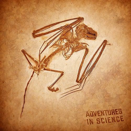
I spent the latter part of tonight tinkering with some photographic elements, off-loading images from a post-Christmas trip to the Royal Ontario Museum in Toronto. That's where this fossil (above) comes from, merged with abstract wallpaper textures and a textbook cover from a summertime trip to an old-timey one-room Mennonite schoolhouse. Also, fun times.

June 28, 2009

197: Worn Out

Photobucket
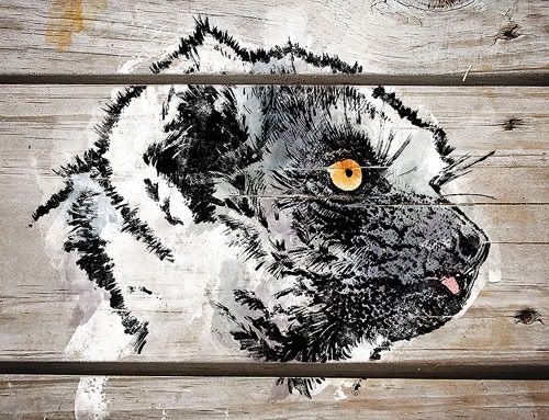
Illustration Friday's theme of worn made me think of a lemur. Yes, that's right.

Not just any lemur, but one I photographed during a spring 2007 visit to the local zoo with my zoom lens in tow. I was there to test the lens out on my favourite Big Cage of Snowy Owls and came upon this tired-looking fellow. Granted, I'm not zoological enough to differentiate a healthy, virile lemur from a grizzled old one, but the mannerisms of this guy led me to believe he was pretty aged – and well-worn.

I sketched this lemur based from the photo, using an equally well-worn Pigma brush pen. I'd been using this pen tons lately and it's quite low on ink now – but this gives me a texture I love when I dab the nib on the page (an effect best seen in the muzzle area). The drying pen was also beneficial for the fur, providing delicacy that a healthy, virile brush pen could not achieve.

To follow the theme even moreso, I used an image of weathered wood planks to superimpose the illustration over, placing down Photoshop layers of white paint and muted splashes of colour. I then used a variety of custom brushes to whittle away the spaces between the planks and bring out a few cracks in the surface in an attempt to mimic painting the piece directly on wood.

A closer look at the detail can be had, here.

April 27, 2009

188: A Tale Of Theatrics

Photobucket
There's a long-ish story behind this fellow; and, to be entirely honest, his story began well in advance of this week's Illustration Friday theme of
theater. But along the way he struck and overcame obstacles, had a near-death experience and then, earned a shot at redemption. What started as an honest attempt at drawing something – anything, really – without using my fine-nib Pigma Microns, was shunted to the wayside following a misguided stab at adding charcoal to the mix of übersoft pencil shading.

I wrecked it. I was mad. I almost tossed it in a theatrical fit of frustration.

Instead I let the drawing sit for days before eventually deciding to scan it anyways and use it for an attempt at some loose-and-dirty Photoshop colouring. Truthfully I didn't know where it was going to go. I tinkered with various ideas before Illustration Friday came along with its curious theme and I set to work honing this final piece. All told, from start to finish, it simmered for almost three weeks. The final illustration is concocted from a few different soft-lead pencils, charcoal, Photoshop colour layers and washes, an overlay of wood grain and a few other miscellaneous photographic offerings. You can garner a more detailed look right here, in my Flickr stream.

February 11, 2009

177: Think Small

Photobucket
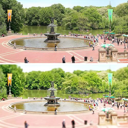
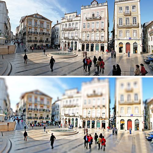
A recent and unprecedented run of consecutive snow days had me finally getting around to trying tilt-shift photography – a digi-technique I'd read about in the past few months. I did not have many photos that fit the bill, and I'm keen to take some photos downtown specifically for this once the winter is over and done with. But for the time being I used a tutorial found via Drawn! and attempted it on a pair of suitable panoramic photos I took during past vacations. This technique, combined with certain subject and compositional criteria, has the ability to give a photo the illusion of a miniature model – criteria that includes:

  • subject matter believable enough to be miniaturized in a model (urban scenes work best, naturally; streetscapes, train yards, etc.),
  • a slightly elevated viewpoint (as one would typically view a model), like from a balcony or bridge,
  • sharp directional lighting, particularly full sun, to mimic indoor bulb light or spotlights,
  • tight composition – shots out of airplane windows need not apply – again, to ensure believability.
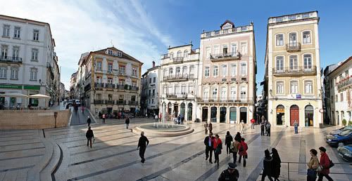
Originals and stylized versions are on display here of Bethesda Fountain in New York City (above) and Praça 8 de Maio in Coimbra, Portugal (below).

Photobucket
To make the technique really work, the criteria above should definitely be considered before the photo is taken. These images of mine are what worked best without being able to do so; as such, there are still flaws with both. For example, the Central Park
fountain and banners would be wholly in focus if this were a real model, and more foreground than sky in the Coimbra panorama would be preferred (I also did a quickie patch job here to 'eliminate' a few folks). Both shots also show more detail than perhaps one would attempt in constructing an actual model, and there are many subtleties to consider in the blurring procedure to make the technique pop just so.

You can click here to access a handful of absolutely ace examples where the technique is done right, and here to follow a pretty basic tutorial of the process.

November 19, 2008

165: The Great Pretender

Photobucket
Illustration Friday's theme of pretend painted an image in my head fairly quick – that of a half-mechanical "pretend bird" caricature, featuring a spring-loaded musical note shooting from a wide-open beak. Early doodles on a piece of grid paper reflected this, but somewhere along in the process my allegiances switched from the original concept to what you see here – a far less literal interpretation featuring the original musical note which now may or may not appear spring-loaded anymore (nor the bird mechanical). But since my intentions were honest – and I mostly devoted myself to the cause – I figured I'd still enter this under Illustration Friday's theme. I'd be more worried if I never diverted from an illustration's original course.

Drawn in varying thicknesses of Pigma Micron pen (mostly the .005 and .05 nibs, brush pen and Graphic 1 pen), then scanned and coloured in Photoshop. The musical note and surrounding circle were created in Illustrator and stitched into the line art before colouring. For a bigger and better look at the detail, please click here.

November 08, 2008

163: Jellybean Is Wise

Photobucket
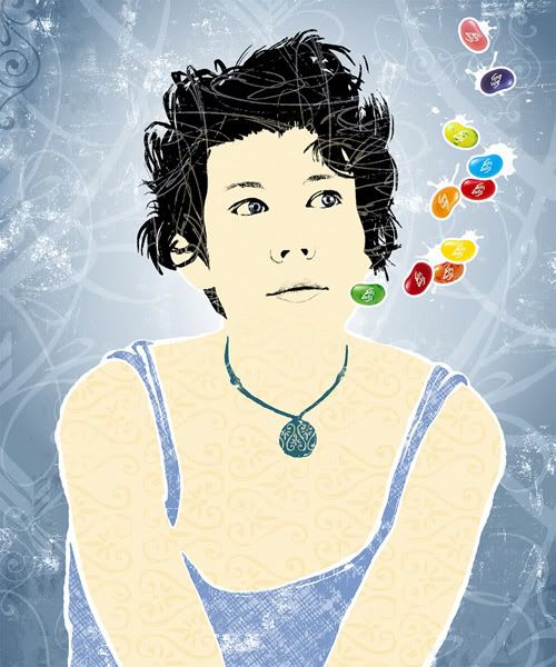
In honour of Illustration Friday's current theme of wise, I present this (mostly) digital concoction of my wife – one of the wisest decisions I've ever made. Based quite literally from my favourite photo of her, it was an exercise largely in texturing and layering, and trying something in the way of a technique that perhaps I'm not so comfortable with – probably why it took me the larger part of an entire day to get it down pat. She's currently in Montréal on a five-day, work-related conference, and shortly after she returns it'll be her birthday. So... happy birthday, jellybean.

Don't you be so mean, my beauty queen, my movie screen
Don't you be so mean, my jellybean, my Boston Cream
Blow November blow, my sweetheart home, before the snow

– "Don't Be So Mean, Jellybean" by Justin Rutledge (though I'm not sure he came up with it).

There's a bigger version of this available for gawking, right over here. Please take a look.

October 21, 2008

161: The Couch Trip

Photobucket
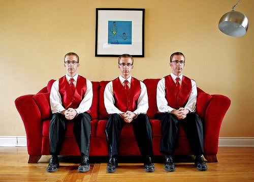
I've been neglecting this site. But rest assured, I've concocted a methodology here to boost productivity: well-dressed clones.

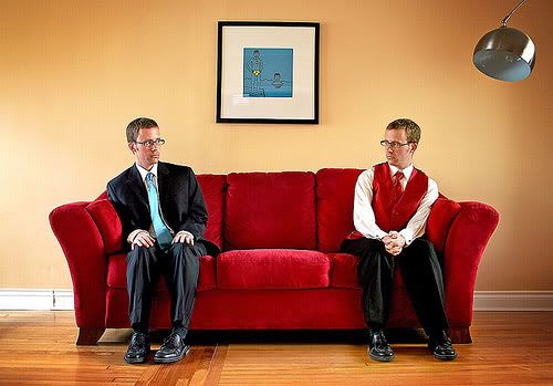
These were results of a recent bout of Photoshop play-time and a rental tuxedo, courtesy of Allan's wedding (mentioned previously). I moved nearly every scrap of living room furniture to pull this off; stuff was either in the frame or casting a shadow in the frame (the lamp remained; I enjoy its slight hindrance to the overall symmetry of the photos).

I had some questions about the lighting: it's natural – there's a bank of windows six feet or so to the right and another set about 15-20 feet to the left, with diffused late afternoon light coming from the right. The dimming of light reaching the corners of these shots is artificial, the result of adding gradated duplicate layers in Photoshop set to multiply mode. Some additional (subtle) dodging and burning was done to other portions; the artwork on the wall, the sides of my face(s), etc.

With a tripod, I took sequences of timed photos of myself on all three couch cushions. These ones, looking directly forward, worked out the best, but a quick second series with my own wedding suit created some options also. Let me tell you though, this is it for me and neckties for awhile – those things were giving me a rash after some time, creating yet another patch job in Photoshop.

Photobucket

September 22, 2008

159: Fingers Are Jerks

Photobucket
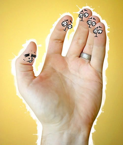
I love Illustration Friday's current theme of clique, in my mind one of their most creative keywords in weeks. Originally I was going to try and draw a caricature of my Grade 10 class photo – all gawky mullet and seven-hair moustache, a look that successfully shunned any and all area high school cliques – but an evening on the couch with Kerry, watching Flight of the Conchords, changed all that. My feet were on her lap, she was tugging on my big toe, and I realized how much of an oddball that fellow is (and by extension, how clique-y the remaining toes are). This image above (but with toes) popped into my head. But toes aren't quite as expressive as fingers (and in my case, hardly photogenic), so I opted for a hand instead. And from there – as you can see – it was an amazingly simple concept to produce. The only special skill involved was matching up my facial pen doodles to the original hand photo.

You can click here, for a slightly larger view.

August 25, 2008

156: Old-Timey Fun-Timey

Photobucket
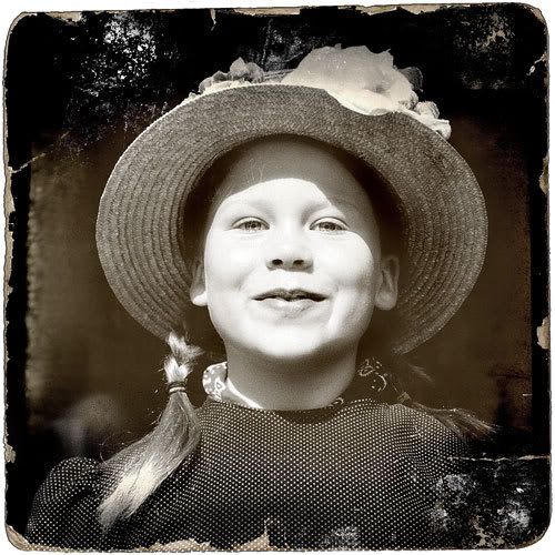
Just goofing around, experimenting with this 2005 shot of Kerry's niece taken at Batoche National Historic Site north of Saskatoon. The interpretive centre there had a tickle trunk of sorts full of vintage clothes, and Anna – camera-shy on that particular day – was proud to show off.

The edge effect I pilfered from Renee Robinson's (aka the immensely talented Playingwithbrushes) Flickr page. Her photostream is stuffed to the dusty rafters with elegant, delicate portraits and other imagery – the perfect treatment for Photo Friday's current theme of old-fashioned. A closer look at the original photo can be had here.

August 21, 2008

155: X(OXO)

Photobucket
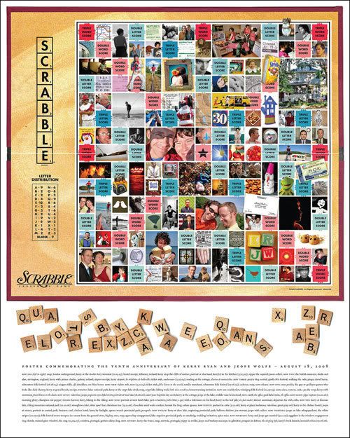
It's been awhile, but I'll admit that part of my self-imposed hiatus was a ruse. I needed a healthy chunk of time to create this poster, which I pieced together over the last couple of weeks in July in order to provide enough time for float-mounting in advance of our ten-year (non-marital) anniversary.


This poster was constructed as a companion piece to a similar one I made in the summer of 2003 for our fifth anniversary (and that poster was modeled after Charles S. Anderson's amazing Seinfeld tribute jobbie for Entertainment Weekly). The initial poster was built around a New York Times Sunday crossword, filling in squares with bits of photos, scans and memorabilia saved over the years. It was always my intent to make a second one, similarly built with a Scrabble board as base.

The board itself is a stitched composite of four flatbed scans, then a layer-happy Photoshop file was made to accommodate the 100-or-so images that fill in the blanks. I made five folders for the years covered and stuffed them with the choicest cuts, so to speak; photos, concert stubs, scans of cards, even maps. From there it was an exercise in patchwork; deciding which images go where, arranging an approximate chronological order of things, tidying up the grid. With my own personal digital camera era in full effect, the selection and scanning process was greatly reduced in comparison to the first poster.

The two posters now share headliner billing at the end of our dining room table. And in the end, we shared a nice little anniversary day.

You can click here and here, respectively, for much closer looks at the old and new poster.

June 04, 2008

Bonsai!

Photobucket
Biding my time, blogwise, on the last days leading up to my first visit with new nephew Avery in Nova Scotia (with a whistle stop in Toronto to witness the majesty of Leonard Cohen). I have a couple of items to post in the near future before taking a blog break to work on the next GDC Manitoba e-newsletter. One, a submission for the second issue of local art zine Paw In My Face (bearing a theme of hate), and two, an illustration I sketched for fun while trying out a new set of watercolour-inspired Photoshop brushes from the relaunched Design Bureau of Amerika. These will be posted shortly, no doubt alongside photos from our quick-but-memorable jaunt east.


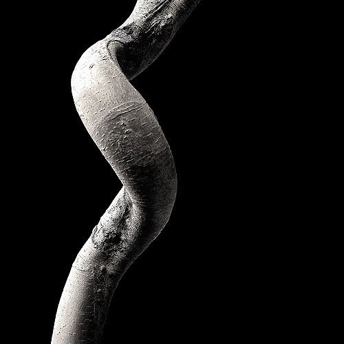
In the meantime however, Photo Friday's current theme of minimalism brings to mind this shot (above) of a bonsai trunk, taken at the Assiniboine Park Conservatory a couple of years ago. One post-processing note: I dodged the original darkened background to a pure black in Photoshop, then added extra black to make the image a square (click here for a more detailed look).

May 03, 2008

144: Portupanoramarama

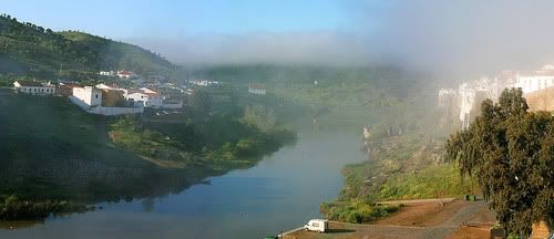
The vacation, today, is officially one month old – and I am finally prepared to stash my photos in a folder, designated henceforth as memory-inducing. My final vacation-related activity was piecing together a generous handful of multi-photo panoramics I took on the trip. These shots are a combination of Photoshop's Photomerge feature and hand-and-eye stitching work.

Photobucket
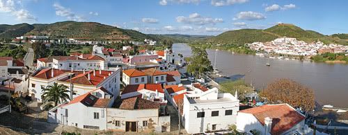
Above: morning fog lifts from the Rio Guadiana, as viewed from the balcony of our hotel room in Mértola. Still quite early in the trip, this photo was taken on our self-guided bike tour. The previous two days featured constant threats of rain, and I woke up very early on this morning to check the weather from the window – expecting ominous, overcast skies but witnessing this beautiful scene instead. Four-photo stitched panorama (click here for a larger view).

Photobucket
Above: a seven-photo panorama of Alcoutim, one day later, as viewed from the village's castle ruins. That's the Guadiana again, much larger at this point, where it forms the border between Portugal and Spain. Click here for a larger view.

Photobucket
Above: a five-photo panorama of morning bustle in Praça 8 de Maio, Coimbra. There are flaws in this piece if you look close enough, but I absolutely had to have this shot. I did some initial seaming using Photomerge and went to work on the rest by hand, adjusting architecture, tones, angles and even a couple of people. Click here for a larger view, where some of the flaws become more apparent.

February 18, 2008

139: Cereal For Dinner

Photobucket
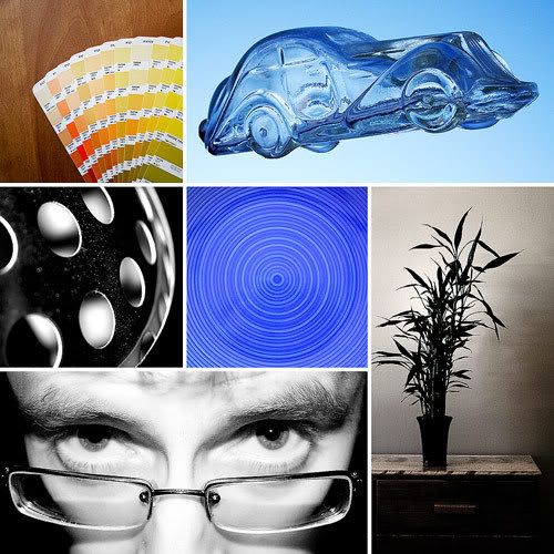
Top row (left to right): synchronized swatches!*; glass car on blue sky. Middle row (left to right): living-room lamp abstract; our new dinnerware is making you sleepy; the bedroom bamboo. Bottom row: me, flashing myself at night.

I didn't do it cuz' it's cheap / I didn't do it for the freedom / You know what? / I did it 'cuz sugar and milk is good eatin'. – Mcenroe, "Cereal For Dinner"

It's Manitoba's inaugural Louis Riel Day long weekend, Kerry and her sister are girling it up in New York and Philadelphia – and I'm reacquainting myself with the camera, having only taken a few shots with it since New Years. And all the while I've managed to squeeze in a few bachelor weekend essentials: leftover pizza for breakfast, leftover pizza for dinner, Hockey Night In Canada with a brownie and ice cream, White Stripes turned up to 11 and watching a tape of The Big Lebowski while my inner dude abides. Yessir, the February long weekend has been the greatest addition to Canadian society since universal public medicare.

(* if you get this reference, then a gold star for you.)

February 03, 2008

137: The Boxer And The Boxed

Photobucket
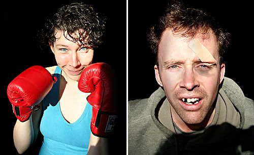
One thing that the stubble I let accumulate on my face any given weekend has going for itself is that it can make me look awfully decrepit. Pieced together with bedhead and my frumpy faded green hoodie – the most comfortable item of clothing, ever – and I may not be much of a specimen. That was part of the inspiration behind this impromptu diptych. The remainder comes from Kerry's avid – and growing – fascination with the boxing-related workout she attends more and more each week (so much so that she invested in this pair of extremely cool Green Hill gloves). So this past weekend, when the winter afternoon light was screaming just so through our living-room window, we posed for each other in order for me to craft this slightly-Photoshopped scenario.

Both photos underwent some post-production, primarily with the burn tool to eliminate background information (not hard, considering the focused power of the sunlight). My own portrait features added treatment, in the form of missing teeth and a slight shiner ("gross", Kerry winced, when she saw the end product on screen). Though no physical harm was inflicted in the making of this diptych, I cannot stress enough how similar the end result would be after an actual tilt in the ring.

Better looks at the portraits can be had here, and here.

January 16, 2008

134: A Stitch, In Time

Photobucket
I've been in a creative malaise, coming off the holiday season ­ – I make no
bones about it. When I get this way, I see my sketchbook tucked in my backpack and fear it. I fear starting a drawing, even though I know that, quite possibly, even a few minutes into a concept I will be knee-deep in the idea, thinking of the execution and rushing myself toward a conclusion.

Even this week's Illustration Friday theme ­ – stitch – ­ I let slip by until Kerry offered a suggestion of a "creative night", where I would draw (or photograph) and she would work on her writing.

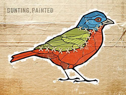
The concept of 'stitch' made me first think of a fantastical species of bird
comprised of parts from all my personal favourites: a nuthatch, a saw-whet owl, a snipe or ruddy turnstone perhaps. But recognition of these ­ – and most ­ species – is largely through the head, or by seeing the bird as a whole. Most of these would not make much sense otherwise, visually. But there is a bird that exists (though I haven't seen one, living as far north as I do) that appears naturally stitched together: the painted bunting. Built from red, green and blue, as if invented by a six-year-old wielding a basic pack of Crayolas, the painted bunting was an easy specimen to craft and contort into a submission for Illustration Friday's theme.

The illustration, using a field guide as reference, was created with Pigma Micron pens (of all manner of thicknesses). Scanned, tweaked and coloured in Photoshop, the piece was eventually layered overtop a texture photo of the bottom of a cardboard box. To view a better look at the detail, click here.

January 10, 2008

Twenty Ought Seven

Photobucket
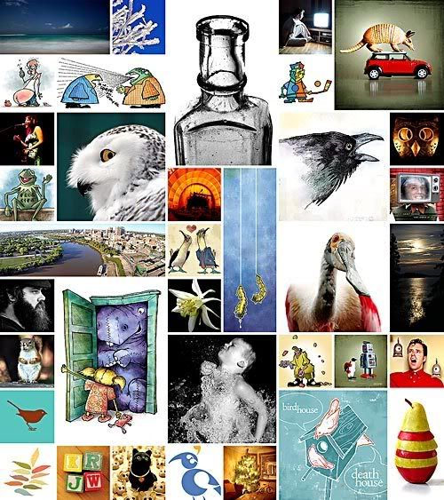
I've been a little slack in wrapping up the year on Jeopopolis – something to do with a certain marriage to a certain somebody – but now, above, is my third year-end collection of self-directed projects that, as I've mentioned previously, would never have been possible without sitting down and telling myself in the first place to get off my duff and create more. I forget sometimes about the beginnings of this place, created from the murkiness of a deep creative funk I had worked myself into a few years ago.

But over the course of 2007 I also found myself taking mild to heavy advantage of this blog's original goal (that to create something – anything – once a week). You may not have sensed it, but I have, quietly. Sometimes, life creeps in and steals away time that would previously have been spent with my efforts here. That's to be expected. But I need to steel myself and do even more, especially in the sketchbook. I do draw more than before this blog existed, however, the end product of all my drawing made it here to be posted. And, if you look at the grid above, there's perhaps a dozen illustrations or less – my entire drawing output for the year. So, while I don't necessarily set goals for myself often, one will be to sketch more. Not illustrate, but sketch.

There. I said it. Kinda cathartic, really. Now I need my butt kicked (Kerry said she'd do it, right in her wedding vows – no foolin'). Feel free to e-kick it, whenever I go a ways and don't show any sketches.

Click here, for access to a better look at the montage.