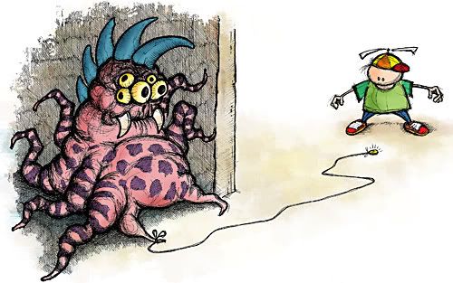
Don't pick up that coin, kid.
Lately I seem to have been in an outright sketchy mode when it comes to putting stuff here. Which is good. I have to remind myself to loosen up when I'm drawing, when more often than not I'm attempting to get lines and curves to mimic a technique bordering on vector-based.
Case in point, this little piece of storytelling here. For Illustration Friday's theme of trouble, I felt like drawing a monster – and then working from there. And for monsters there are no rules, and as such, nothing suited my monster more than making one as loose and as sketchy as I could. The kid and the coin were added afterwards as I molded my idea to suit the theme.
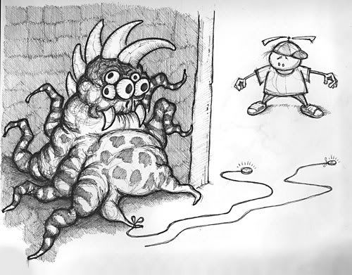
You'd think the bumps and jiggles of an eight-hour road trip would cater to this style I'm striving for, but I guess I'm not that loose. I tried, coming back from a Thanksgiving weekend in Saskatchewan, but I couldn't seem to get to that point where I could draw in the car. So instead, I spent a good chunk of Tuesday evening at home with this drawing, and finishing it over lunch on Wednesday. I spent a couple of hours Wednesday night fixing up any schmegs and adding colour. You can click here for a better look at some of the detail. Also, below is a look at what I had to work with before delving into Photoshop, as an example of how much cleanup I sometimes do digitally.


19 comments:
Brilliant work! This is really fun.
WOWWWWWW!The monster looks terrible~Poor little boy!Great work!
haha, great monster and illo.
great illo and monster! nice!
this is funny! I like how you made the theme fit what you wanted to draw. Great job, as always :)
LOL! What cause more trouble than a monster! I like the sketchy feel of the monster, it adds a humanistic feel!
Appreciate the note! Next week, we'll have to coordinate a little better, huh?! Cheers!
If you go strictly by his arms, the boy doesn't look like a very filling meal ;-).
Is this what happens to the monsters when they get fired from Monsters Inc.?
Dave
Thanks, folks.
Dave, that's how I draw arms: I based them from my own.
So fun! I love it!
Awesome! What a fun illo!
that is loose... and funny, indeed! thanks for sharing!
thorsten
i love that monster! this is my favorite illustration this week.
Monsters play the best practical jokes
Oh I just love that monster. The stripes and spots are superb!
That's awesome stuff! Now we know what lurks around the corner. ;)
Very cool photos too. Pictures are very inspiring and colorful. Lovely!
This is great! The sketchyness is really cool, I love the way you've treated the edges of the bricks (fading off).
Thansk for sharing your process, it's cool to learn how others do this kind of thing.
Superclassy and very funny pic! Looseness and spontenaity really help bring out humour and this one is a case-study in making it work!
Very cool! I like how you've done the kid!
This is wicked cool!! Love the idea and the monster is neat!
Post a Comment