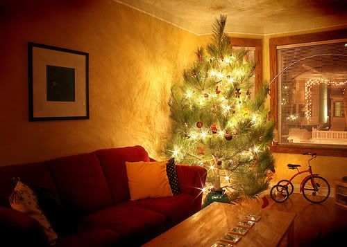
 Christmas is viewed as a season unto itself, and that is no more true it seems than for us this winter. Kerry and I will be engaged – moreso – in all manner of familial comings and goings from now, straight into January. So, to wind up Jeopopolis for 2007 – its smash, best-selling, awesomenatious third fantastic year – I present our Christmas tree in all its glory. This winter we opted for a locally-grown red pine that had to be hewn at the lot just to fit on top of our poor, laden Civic – and also under our ceiling. I think this may just be the largest tree I've had in all my Christmases. But it commands the hell out of the room, and smells delicious. A better look at this shot can be had here, o'er on Flickr.
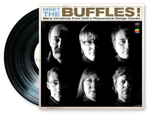
And, in the spirit of the season, the Mac-heads at work sat for a quick, pot-light photo shoot so I could create the design department's third annual e-card to the company. "Buffles" is short for buffleheads – quick, small diving ducks that make their home near many a northern Canadian lake (and also known as butterballs in hunting circles).
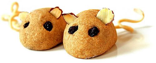
This year I had my first crack at co-judging duties at an annual Christmas cookie exchange Kerry participates in. Impartiality is difficult for the judges – comprising exclusively of cookie-baker-sigoths – and this year even moreso as I designed the top-secret, newly-released Cookie of the Year award that now accompanies the winner for a full year of bragging rights.Kerry created spice mice (this recipe comes close, if not entirely bang-on). Figuring the creations' immense photo appeal (click here for a closer look), I whole-heartedly endorsed this decision. And, much like with last year's mint sandwich stars, they came out of the oven beautifully. Alas, the award went to a competitor (who the heck judged this thing, anyway?). But all contestants come out winners, and this year is no exception as we returned home with a tupperware full of a dozen different cookie concoctions. Speaking of which, I think I'll go crack open that thing.
Bonus! Click here for a surprise spice mice visitor.
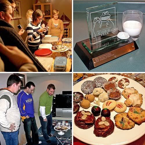
Clockwise from top left: the judges' stash prepares for its close-up; the 2008 Cookie of the Year (with trophy); the combatants; the judges in their impenetrable, underground Judge-O-Lair.
 Scary problems.Except for where I am. That yellow patch dead-center in the weather warnings map before you essentially represents me, sitting at my desk, considering the absolute hose job missus nature delivered today ... across the nation, to all the non-Manitobans who do nothing in gratitude but whine and plonk their cars in the ditch.
I'm a snow junkie. I'm no fan of temperature extremes, but I want my snow. Metres and metres of it. I love walking in it, I love shoveling it. If it falls in one fell swoop I get the day off. It's clean, it nicely obscures the dog poop – it's nature's white space. And it arrives best with a bang, like last year the day before Halloween, or as any Winnipegger worth his kubasa remembers, in November 1986 – me, swan-diving off the porch railing – and April 1997, when I walked alone down an abandoned, standstill Broadway like Charlton Heston in The Omega Man.
Environment Canada – supplier of the map above – has predicted a nasty winter for much of the country. So long as it includes a big-ass dosage of snow, I may be able to withstand the nastiness. I've got a shovel and new mitts from MEC. Bring the snow to someone who appreciates it.
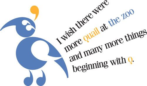 A super-quickie for this week's Illustration Friday theme of the zoo. I'm always interested in the concept of illustrating with type. I even did it once already, creating an owl out of type for a long-ago Illustration Friday theme (see here). So, combining a hand-drawn doodle of a quail I made a couple of months ago with the sudden realization I could rebuild it out of eight apostrophes and I get this.I spent about an hour last night going through my font libraries searching for just the right apostrophe. I almost built my own after a near-futile search when I came across a winner the snazzy 80s throwback, Fenice (I think the Delta Hotel chain used it, at one time).And it's true, too, if you think this is a lame connect to the theme. I'm not exactly in quail country, and wouldn't mind it at all if our local zoo picked one up. But I did eat one however, for my birthday dinner in October. Quite tasty.

Photo Friday's current theme of two was the inspiration behind a Saturday afternoon fruit shoot on our kitchen stovetop. I attempted recreating a seamless single super-pear from red and Bartlett pears – harder than it looks, judging from my skills with the knife – and I suppose I could have smoothed some edges off in Photoshop, but in the end I like the stacked effect here. I also tried a similar stunt with a lemon and lime (with less favourable results), and an apple and orange that didn't even make it in front of the lens. Perhaps another time.
Fruit procured from De Luca's on Portage. That place smelled so good today.
Click here for a closer look (lemon/lime jobbie coming soon).
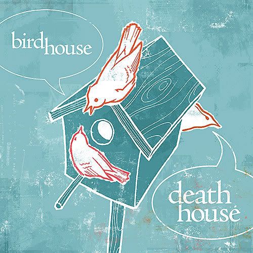 Bird nut that I am, the birds were top-of-mind when I thought of Illustration Friday's current theme of superstition for a moment. Pick up a copy of Graeme Gibson's The Bedside Book of Birds and you'll be spending hours discovering the historic worldwide fixation mankind has with the ties between birds, omens and superstition. And one of the most curious, untraceable and far-reaching omens out there is of "the bird in the house".At first, I was set to take this concept in a Gary Larson-esque twist, with one bird warning another of the perils it faces in entering the birdhouse; a more straight-up cartoon. It was the designer in me that abandoned that path for what you see here.This is a good example of not giving up on a doodle. This illustration began in pencil on the back of some scrap paper, as I fleshed out the idea in particular, the perspective over lunch at work one day. When I opened my sketchbook to create a crisper, more finite version, I found myself unable to duplicate the doodle's vision. So I inked the scrap paper pencil job and erased surrounding notes and scribbles in Photoshop. From there a palette was selected and colouring and texturing were completed on the computer.
You can click here for a better look at the detail.
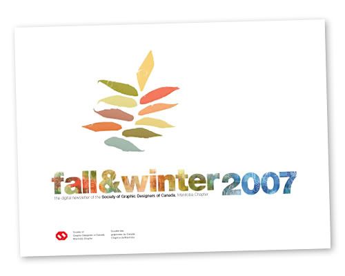
Probably the most time-consuming spare-time vacuum over the past few weeks has been the editing and design of my inaugural edition of the Society of Graphic Designers of Canada's (GDC) Manitoba chapter electronic newsletter. Since roughly this time last year, I've been serving as the communications chair for the Manitoba chapter – a fairly unassuming duty – but had also been delaying work on the (approximately) semi-annual newsletter, one of my chief responsibilities. But a recent glut of local design happenings and story ideas helped pave the way nicely for the project to once again take flight. With its official release this afternoon, I am proud to report that I am finished with my Reason I Don't Blog As Much series.
As for the newsletter, I remain grateful to all of my story interviewees, contributors and fellow chapter members for assisting in its path to fruition – particularly to local designers and photographers on Flickr that came forward to be a part of my feature article. I invite anyone reading this to visit the GDC Manitoba homepage to download themselves a copy.

Top: the newsletter's cover, made in Photoshop with custom brushes built from scanned sumac leaves. Above: a grab from the Flickr article, featuring pears shot by talented local designer-photog Tamara Paetkau.
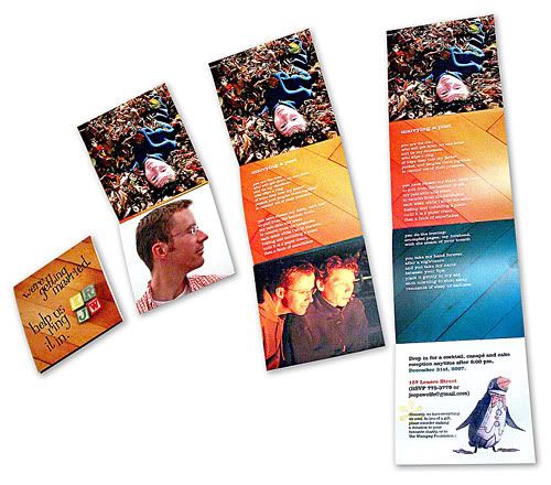
Realizing I kind of snuck it through in a September vacation post, I should do so now: Kerry and I are getting married. We picked up the license yesterday (Jebus help me if Vital Statistics discovers that I don't know my dad's middle name(s) or guessed where my mom was born).But all this meant invitations were in order. More of a formality than anything, since we already procured 13 of the 14 ceremony attendees (at I-do time, mom may be anyplace between Colombia and Argentina), but we are creatives and must oblige expectations.I wish I could put a name to the chap who bemoaned designing his own wedding invites in the font-geek documentary Helvetica but he was bang on: I was, for lack of a better word, intimidated. In the end though, I relied on a treatment that was primarily photographic, relying on the scads of photos accrued over the years (we've been together since 1998) and built a four panel roll-fold creation that tells a loose story as it unfurls, including photos, some basic info and a poem-by-Kerry original.One funny: we realized late that nowhere on the piece does it actually say our names. Pah. You all know who we are.
Sorry about the grainy shot – we don't get too much daylight up here anymore. If you want to see a crisp version, let me know (I'm not about to advertise all our info all high-rez n' stuff here).
I admit that to the untrained eye, I may not appear to be posting as much on my site. That the very mantra that begat this blog at the end of 2004 – that I create something once per week – is going unnoticed and being abused. It's partly true; I don't have near as much to add to the world these days. But the main reason is because I have real things to do. These real things will reveal themselves over the coming days as a handful of personal projects are completed, the first of which…
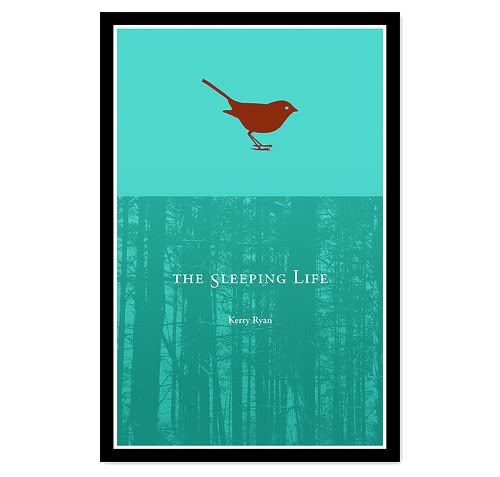
Kerry's book. Two words I love to type, and two words she – and by extension, I – loved hearing announced on the eve of our September vacation. As details have been sorting themselves out and the concrete began to set, the realization it was real struck when the publishers required a bio and cover design be included in promotional materials sent to retailers. Due to the tidiest of associations, I'm proud to report I got the job to design the cover of The Sleeping Life – Kerry's first book of poetry, scheduled for an April release.
Above is the cover. The black frame is a common design element with all of the publishers' books. The remainder however, was almost wholly art-directed by Kerry. She selected a colour scheme, and we went through my field guides to find just the right bird to inspire the cover's silhouette (a savannah sparrow, I believe – birds are a link through several of the book's poems). The forest background I added to provide a base and anchor the whole thing.
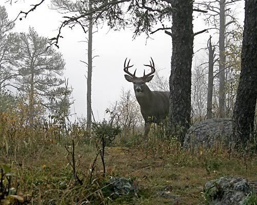
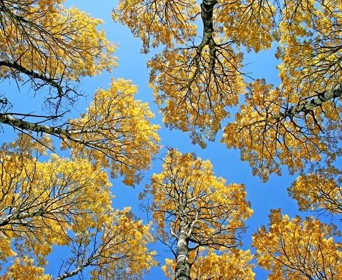
I realized I never came up here – since the computer is in the attic, I consider my blog "up" – to crow about a recent contest I entered and received a fantabulous prize from. The provincial chapter of CPAWS (the Canadian Parks and Wilderness Society) held a summertime ask for Manitoba-based photo submissions for their 2008 calendar via their Naturally In Focus photo contest (view the dozen finalists here). And two of my entries (out of 473 total, though they really, really run the gamut in terms of quality) won berths in the calendar, both snapped on our quick vacation last September to the Whiteshell and Riding Mountain. The photo of a white-tailed deer buck in fog near West Hawk Lake (above) won in the "Manitoba Wildlife" sub-category, and my point-up-and-shoot image of fall aspens in Riding Mountain National Park (below) earned me second place in the "Patterns in Wilderness" section. And though I'm not certain how the prize-doling all worked out, I now have me a sweet $250 certificate for work done at a local framing outlet.
Crisper versions of the deer and aspens can be had here, and here, respectively.